
The Idea that Sparked the Adventure
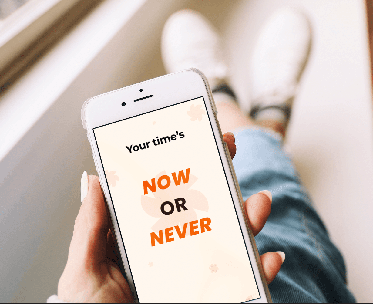
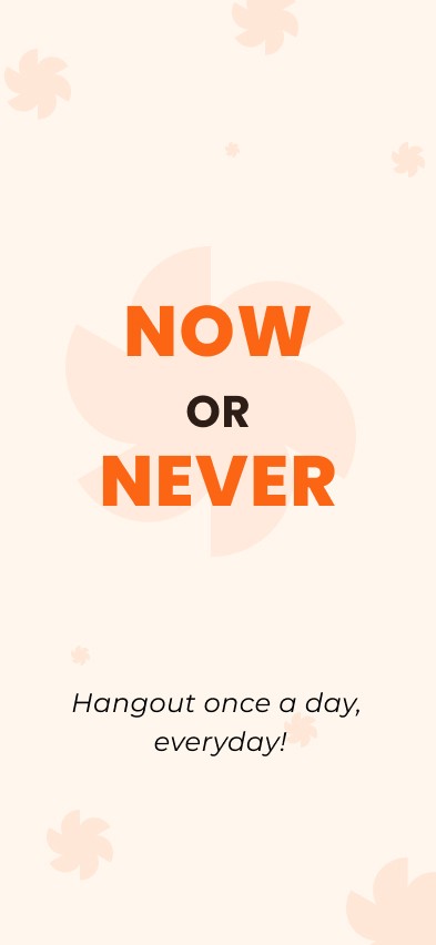
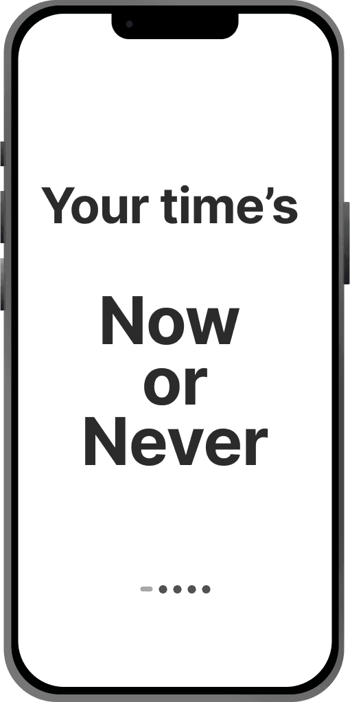
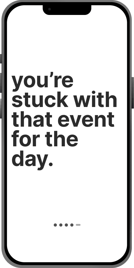
Now or Never is an app designed for young backpackers who love spontaneous adventures. Instead of over-planning, it helps them find and join real-time local events with minimal effort.
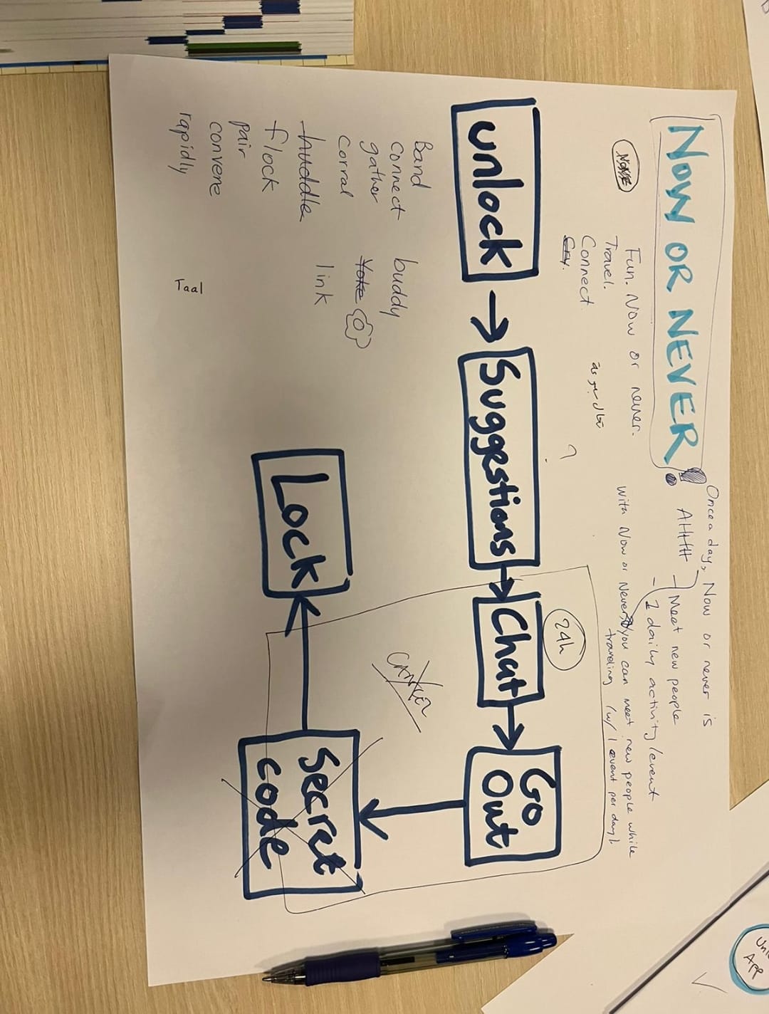
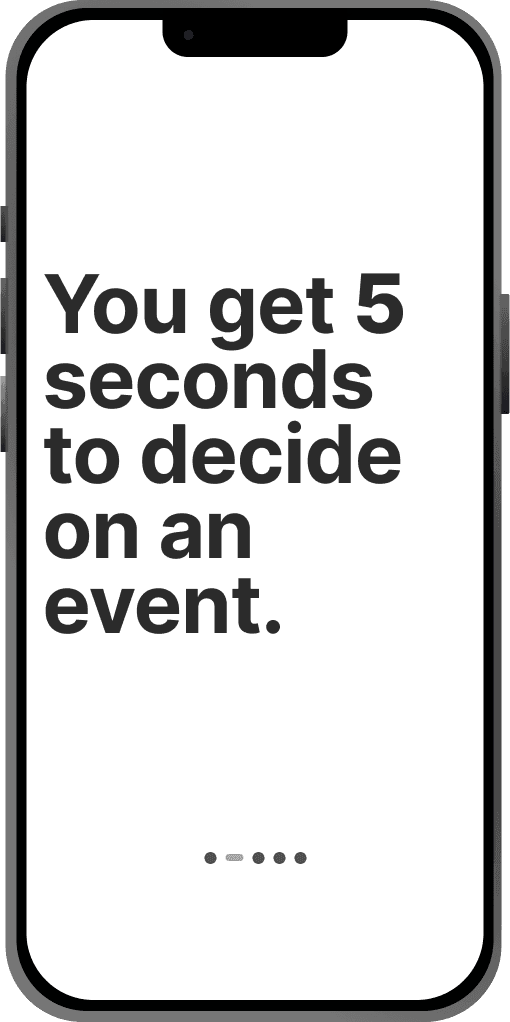
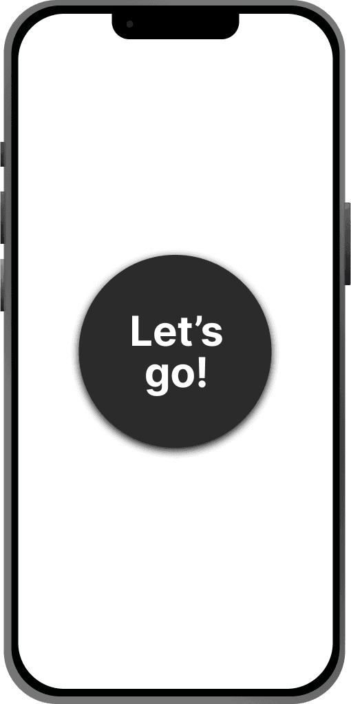
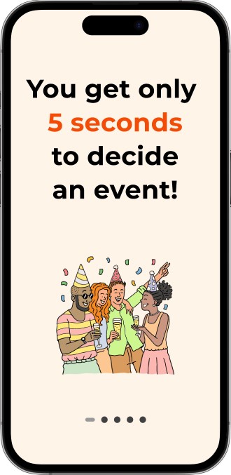
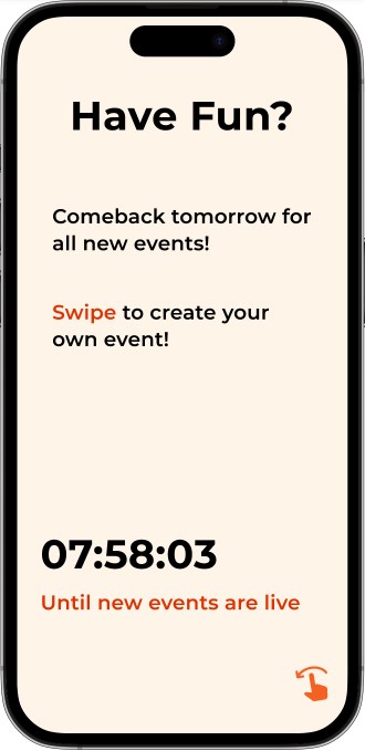
The app notifies users once a day with nearby activities, giving them just 5 seconds to decide. No more long planning or coordination — just quick, exciting opportunities to explore and connect with other travelers on the go.
Our goal was to create a tool that makes spontaneous experiences easy and fun, bridging the gap between travelers and local culture.
2 weeks
22
7+
16
Backpackers often face challenges such as boredom during downtime, difficulty finding local events and the lack of platforms for spontaneous, safe meetups. Existing solutions either require heavy planning or focus on long-term travel.
We aimed to create an app that enabled serendipity - making spontaneous plans simple, safe and engaging
Lonely During Travel
Of all challenges backpackers face, Lonliness and boredom during travel is one of the most common.
Safety Concerns
Major concern while traveling is safety & planning.
Missing out on Local Experiences
Backpackers often feel they might miss out on local experiences cause they might not be aware of local events happening during their travel.
An experience-first app that brings real-time events and flexible booking to the fingertips of modern wanderers.
We designed "Now or Never" to empower young backpackers with an effortless way to find and join real-time, local experiences.
Spontaneous Planning
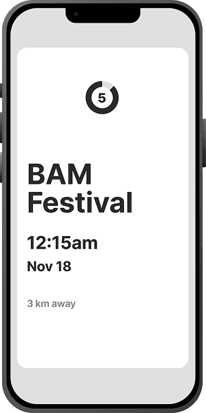
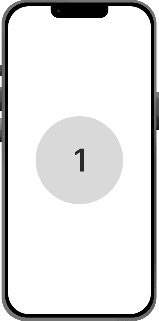
5 seconds! That's how long users get to decide on an event & explore new adventures.
Non-Sticky
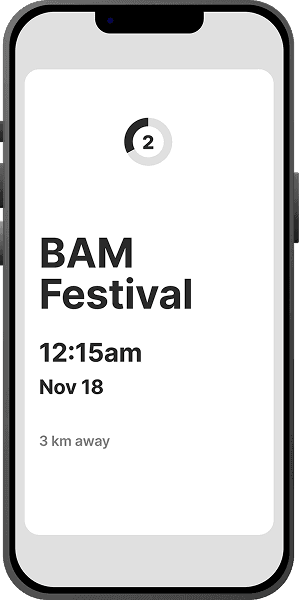
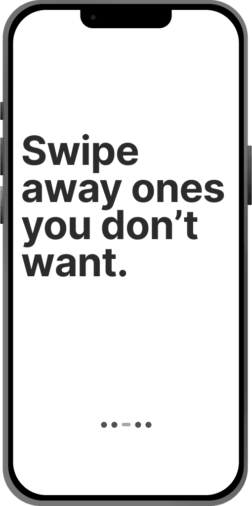
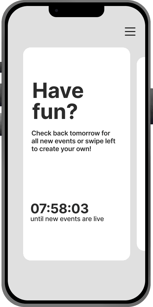
Quick, swipe-based event selection, ensuring users can use the app only once a day, everyday!
Easy & safe to use
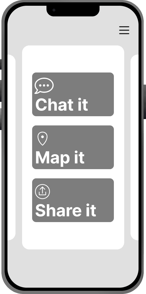
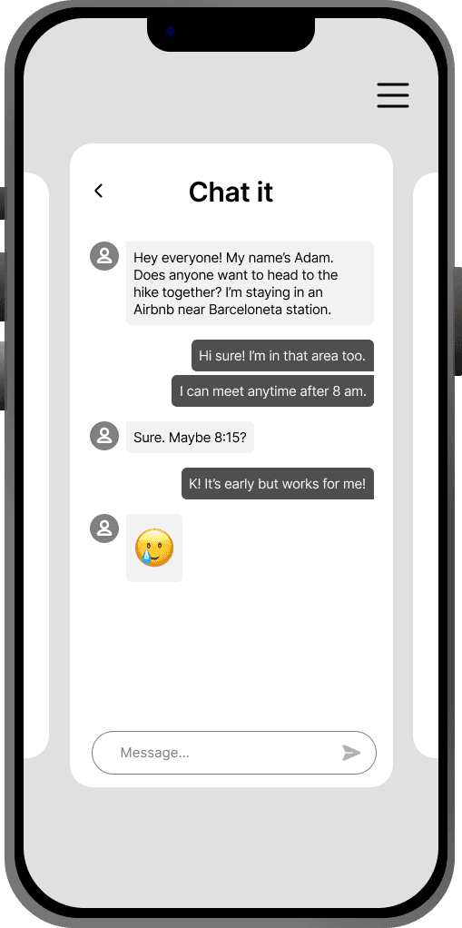
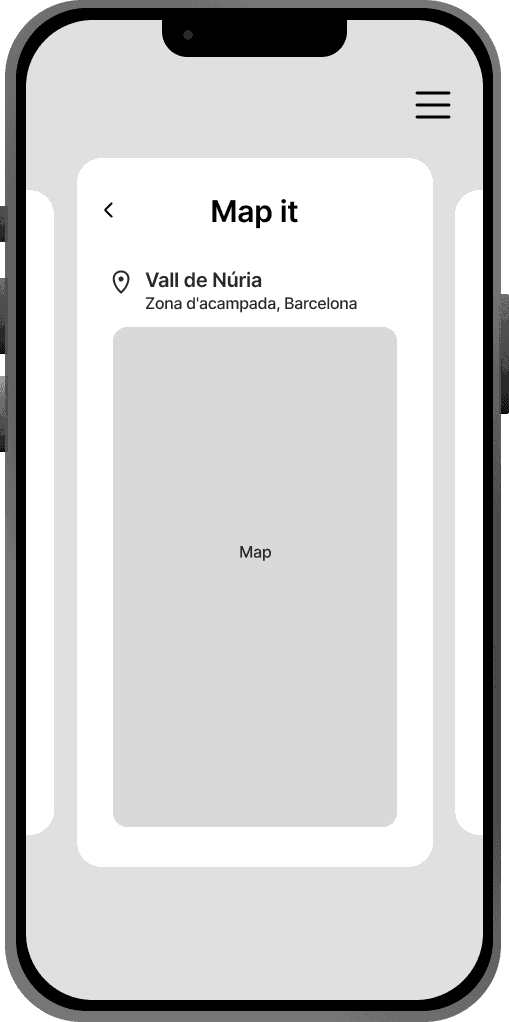
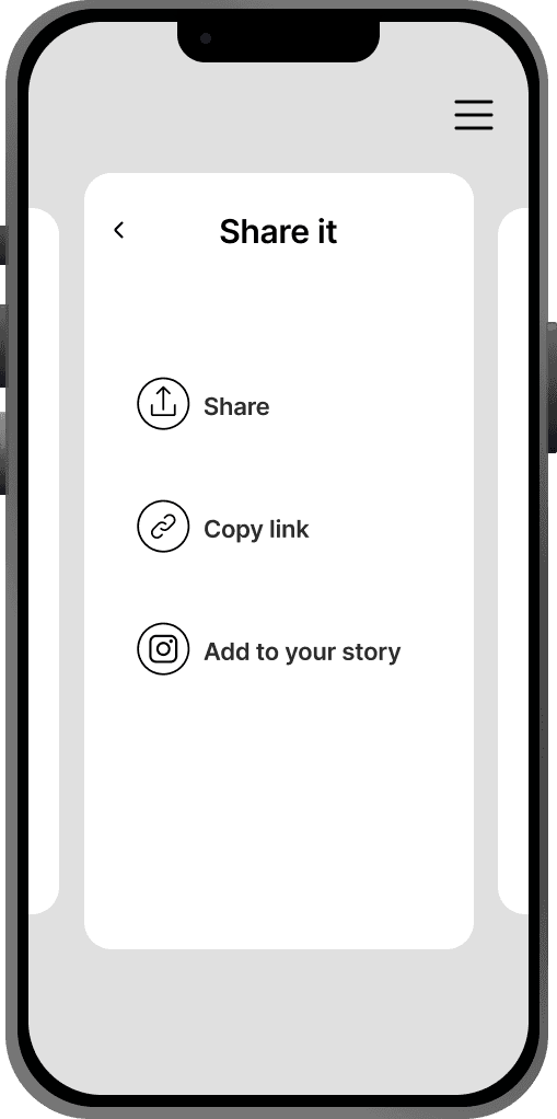
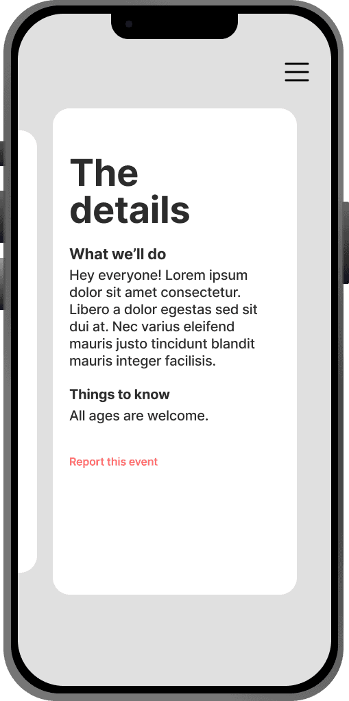
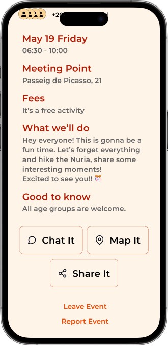
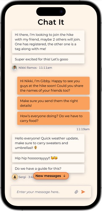
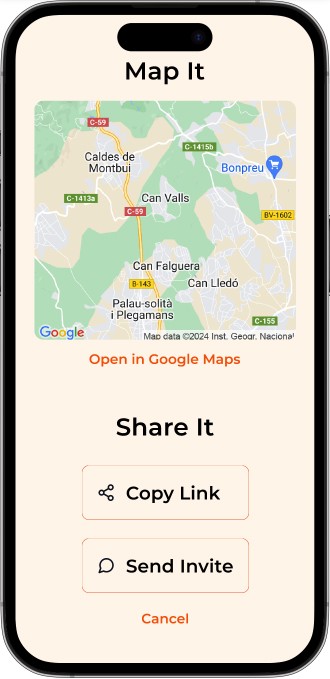
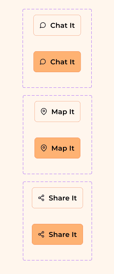
Familiar features like Chat, Map, Share for details about the event, Report feature to track Fraud/Unsafe events, making it convenient for usage.
Curiosity First, Solutions Later
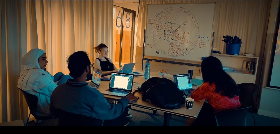
This section details the step-by-step approach taken during the project, including research, planning, design, development, testing, and optimization phases.
Blending creative exploration with user insights to design something that actually works in the real world.
I conducted a deep dive into competitors like Eventbrite, Bumble BFF, and Meetup.
While these platforms enable event discovery and social connections, they lacked the spontaneous nature we sought.

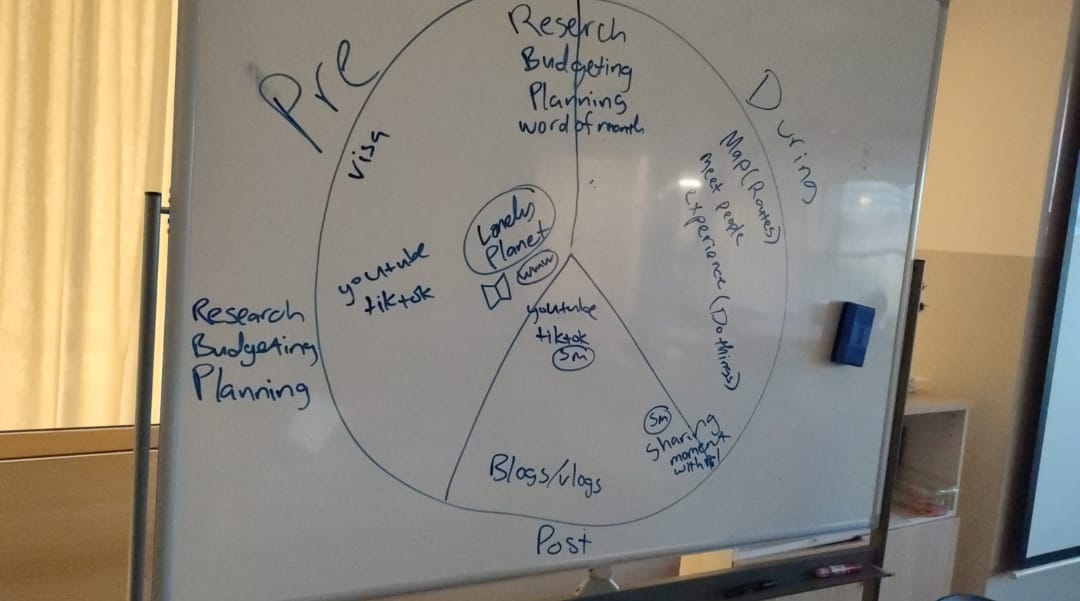
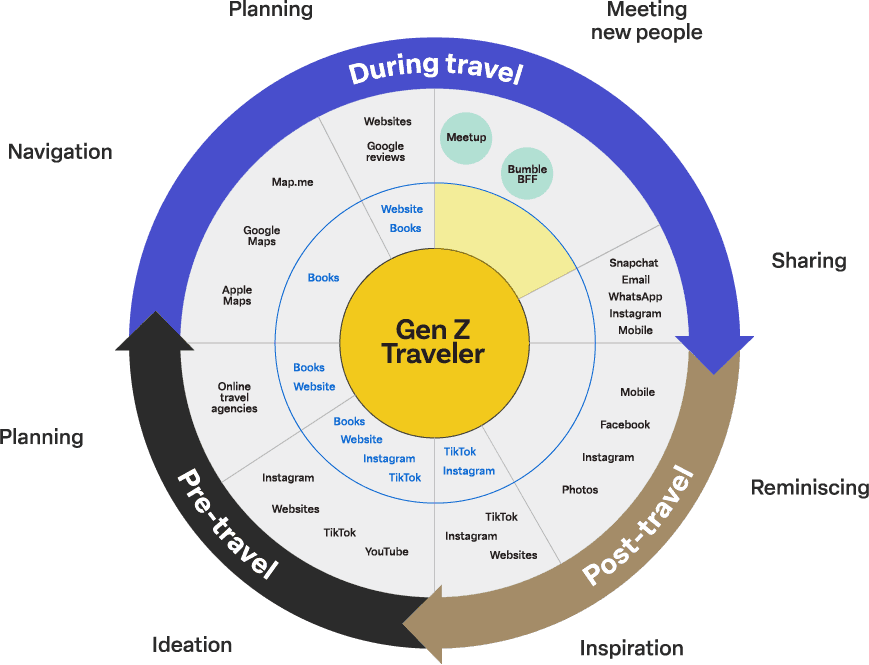
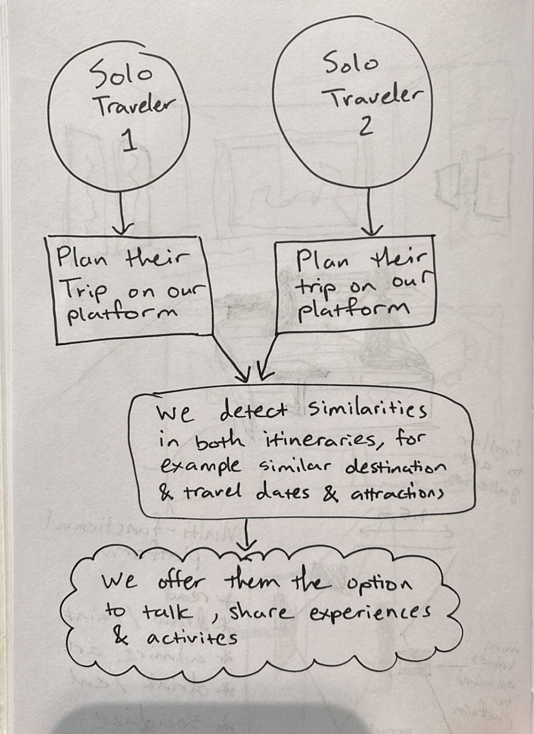
In parallel, we conducted an ecosystem analysis to explore Lonely Planet's role in the travel journey and identify key opportunities to enhance in-person connections during the "Planning - During Travel" phase.
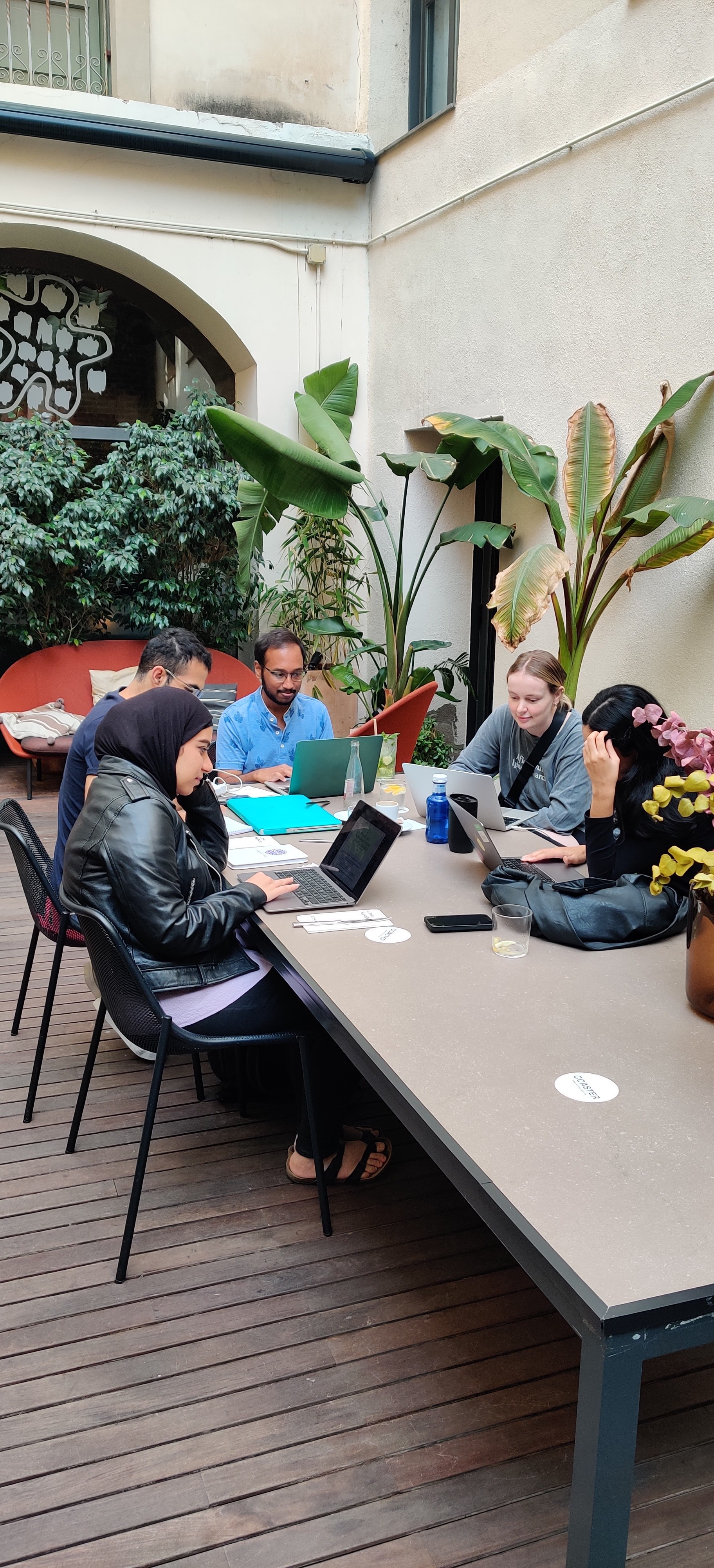
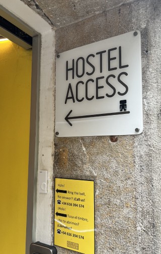
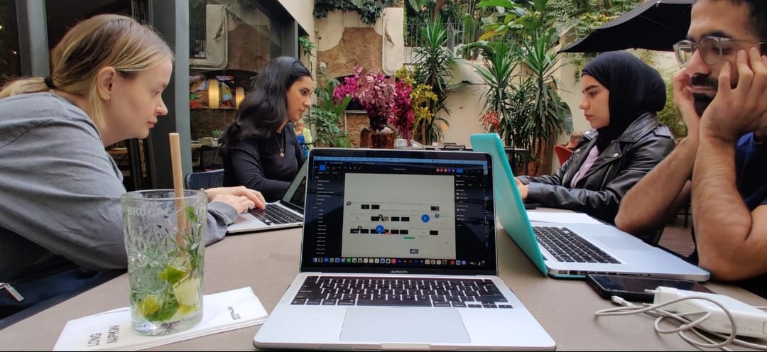
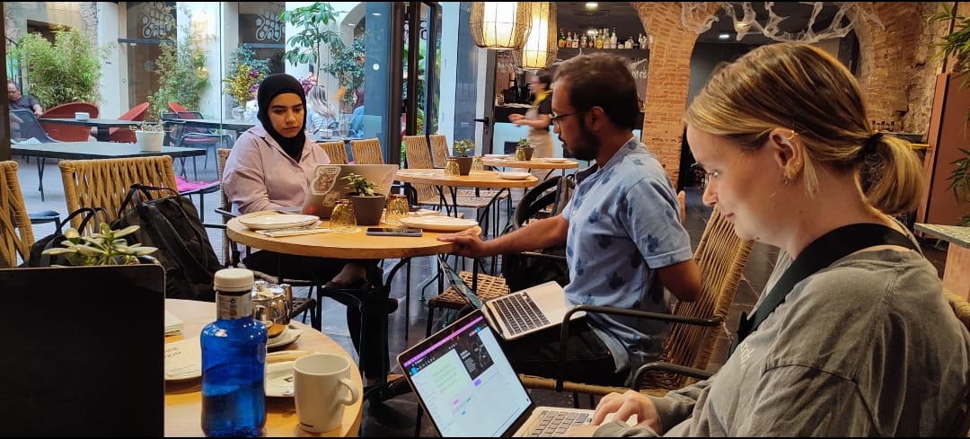
With my team, I conducted interviews with 22 backpackers from 16 different countries across six hostels in Barcelona. Their feedback confirmed that while travelers loved meeting new people, they often didn’t want to invest time in planning.
This insight solidified our mission: create an app that serves adventure on-the-go.
2 weeks
22
7+
16
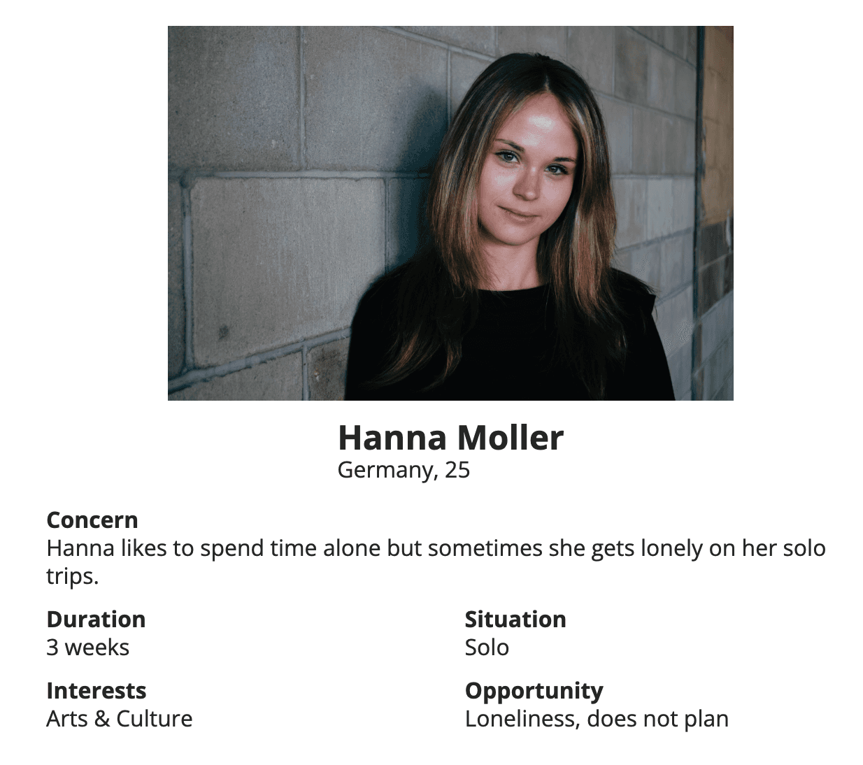
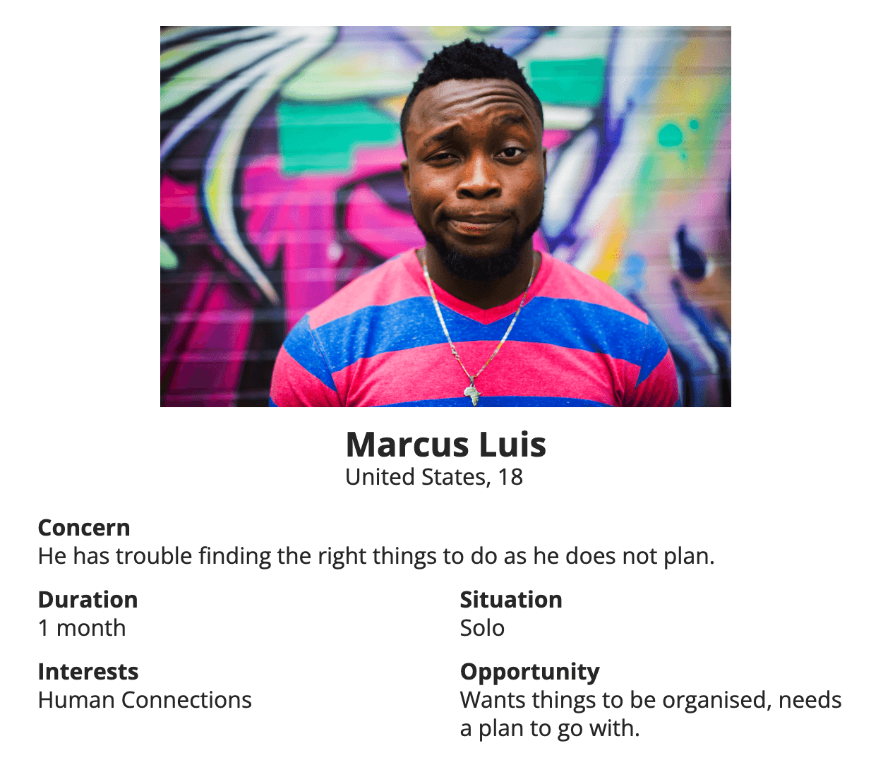
Using the personal interviews with our target audience as a guide, we created user personas. User Persona characteristics can be best described as follows:
Spontaneous Adventurers
They share a common desire to meet new people and embrace new experiences without extensive planning.
Diversity in Habits
Some are active on social media, while others prefer staying offline. Some travel solo, while others journey in groups.
Varied Event Interests
They have diverse interests when it comes to local events and activities during their travels.
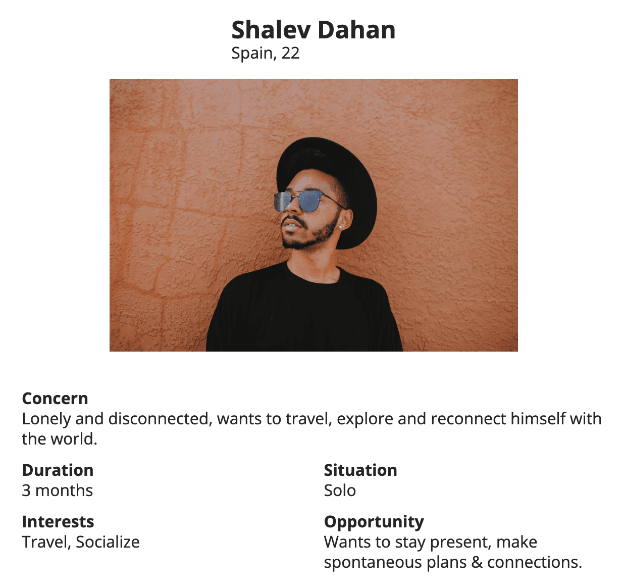
Primary Persona:
Shalev, a 22-year-old solo traveler seeking spontaneous in-person connections and meaningful experiences without extensive planning.
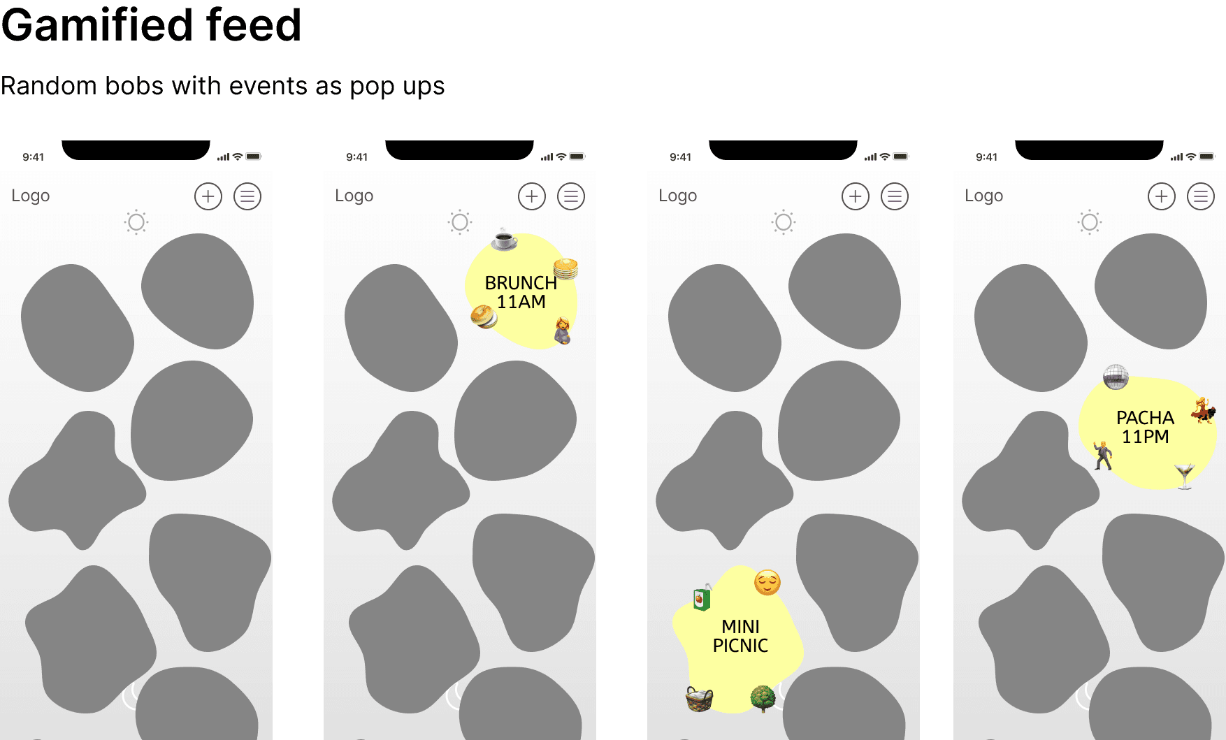
Our mood boards pulled inspiration from apps that prioritize quick decision-making and gamification.
We sketched initial concepts, merging elements from various apps to ensure users could seamlessly find and commit to activities.
Ideas taking Shape
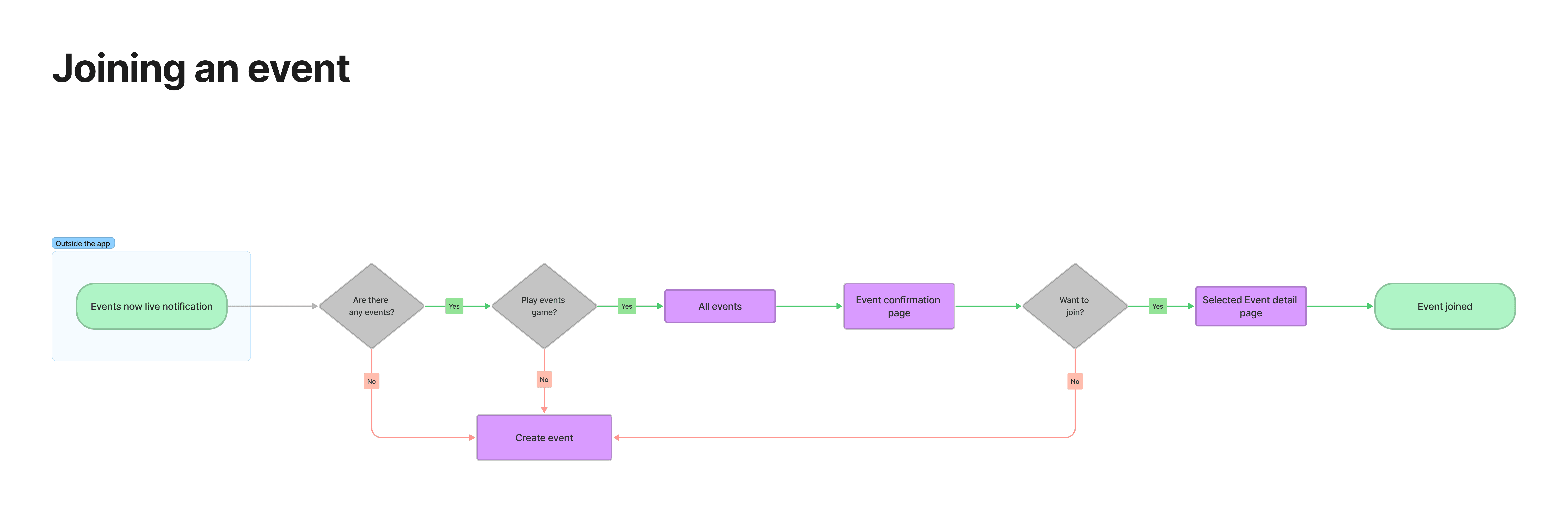
With my team, I started creating user flows to understand the journey of the user.
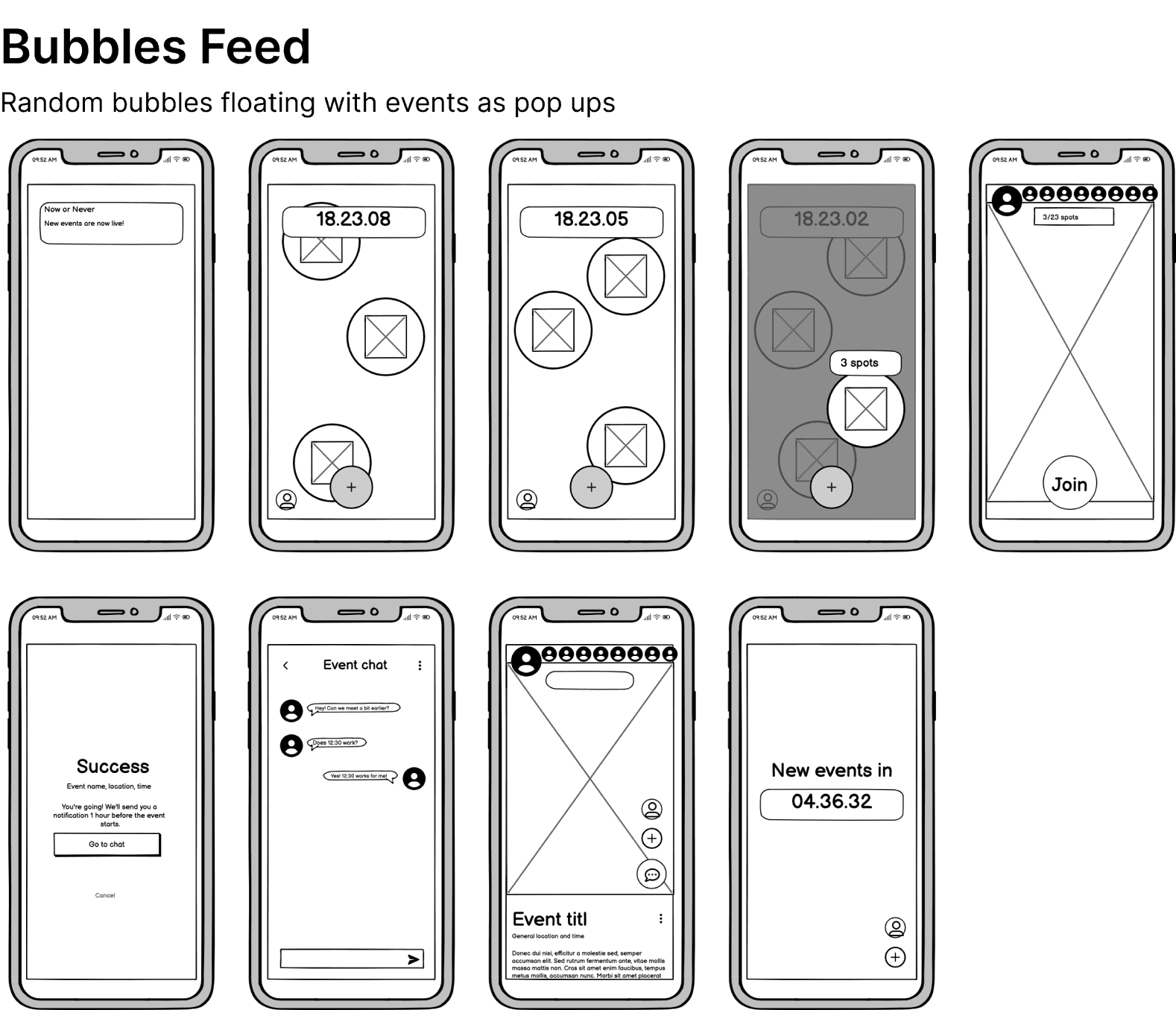
Building on this, I created low-fidelity wireframes to visualize the core flows of the app, such as onboarding, event selection, and event creation.
These Annotated Wireframes guided discussions with developers and ensured alignment across the team.
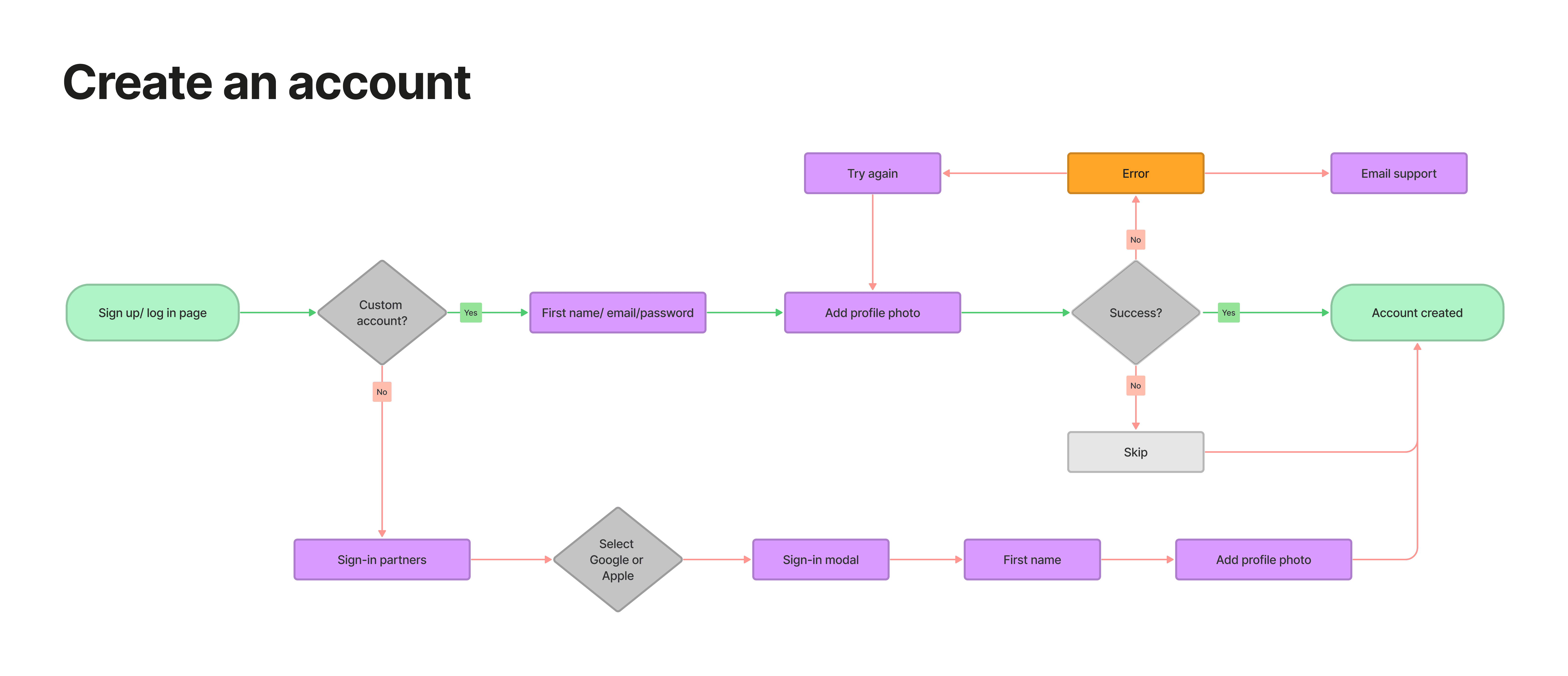
I iterated on the design based on feedback, refining the event confirmation system and user chat functionalities.
This led to an enhanced experience that was both spontaneous and user-friendly.
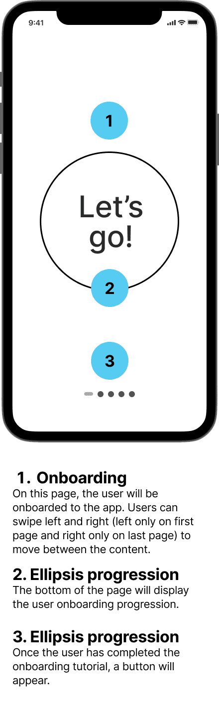
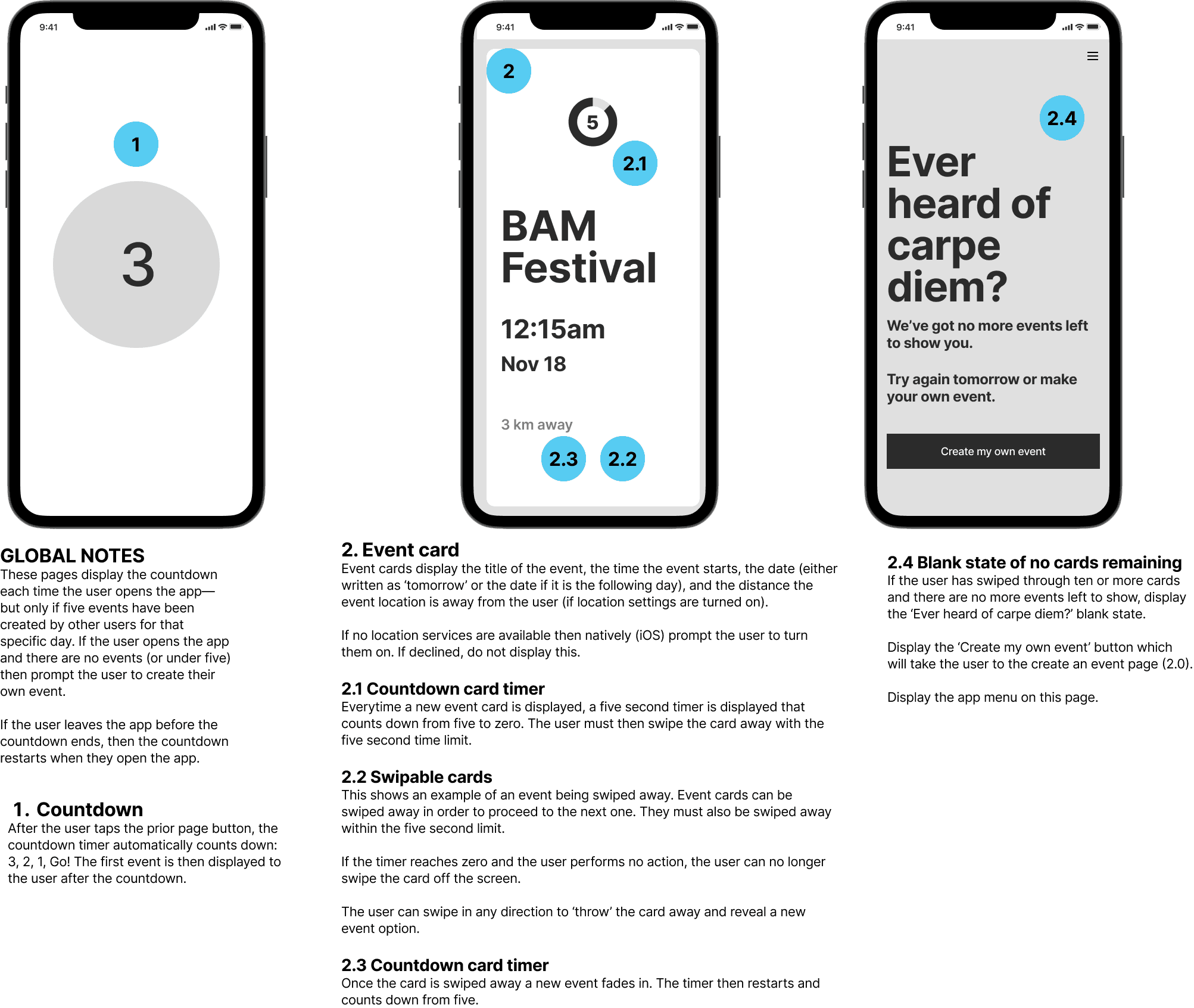
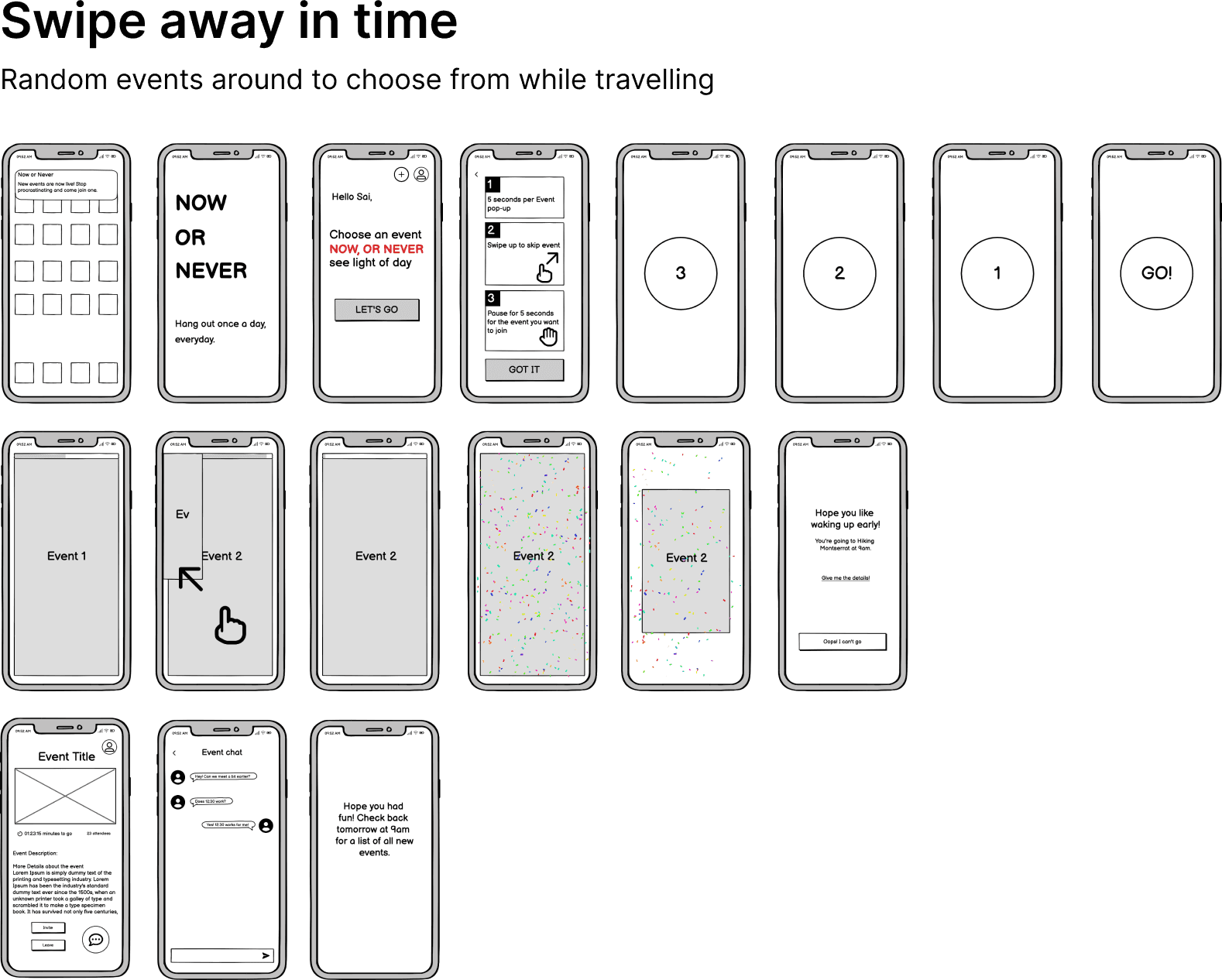
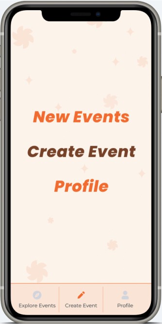
Onboarding
New users are introduced to the app, its rules, and the concept of quick decision-making for event choices.
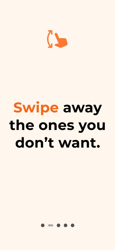
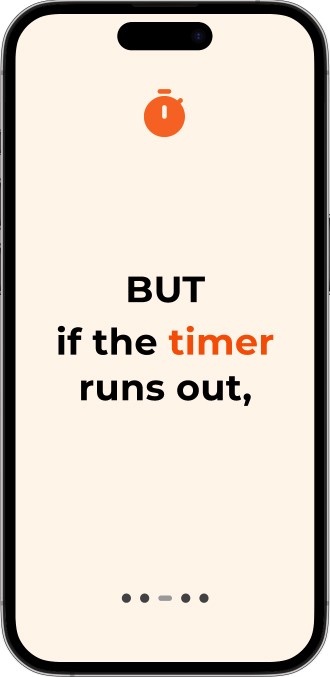
Swipe-based navigation for content, a timer-based decision-making process.
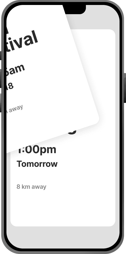
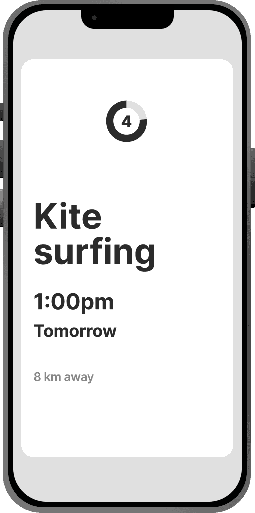
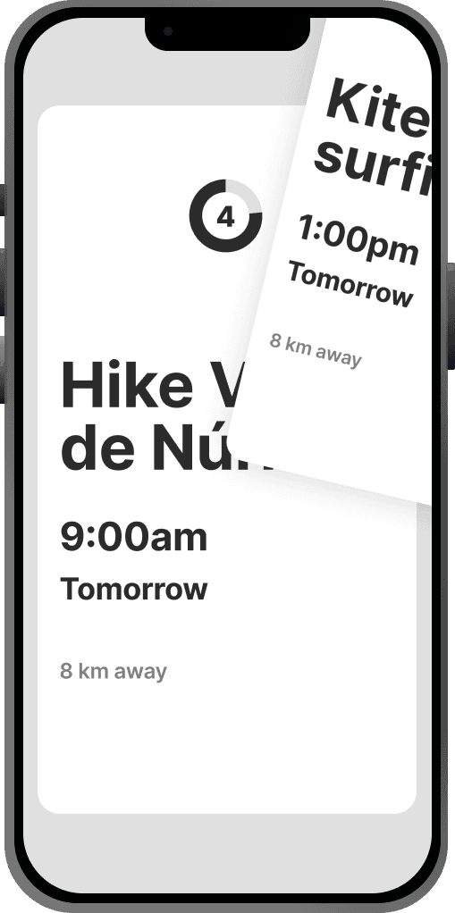
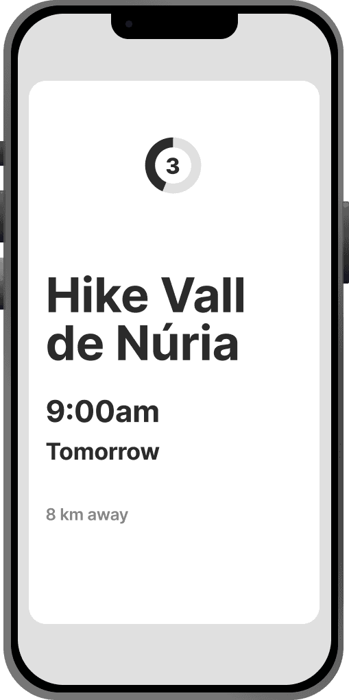
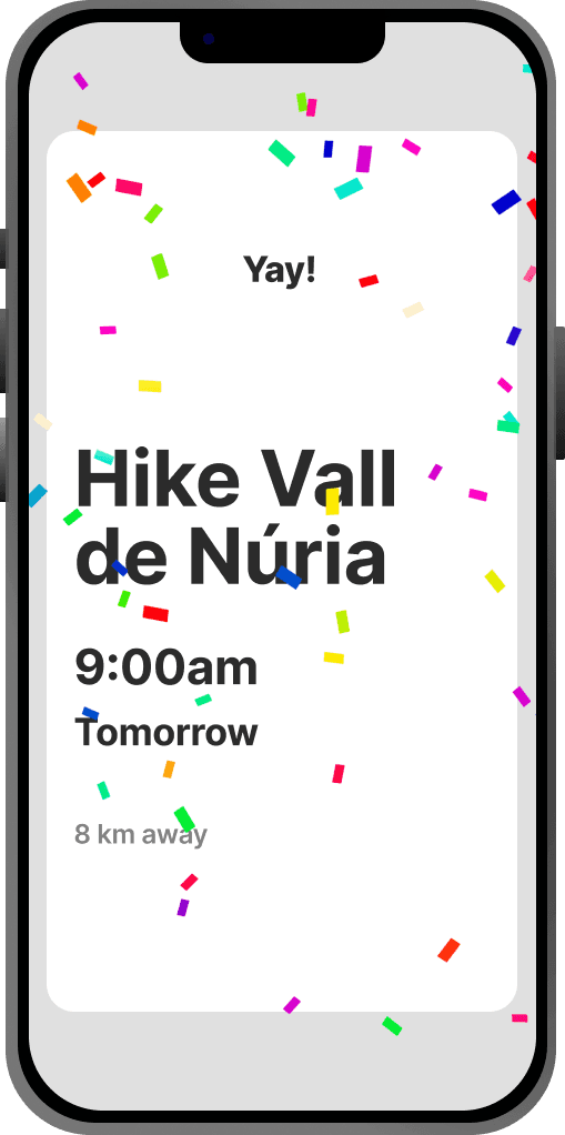
Users get 5 seconds to decide on an activity, enhancing the spontaneous nature of the app.
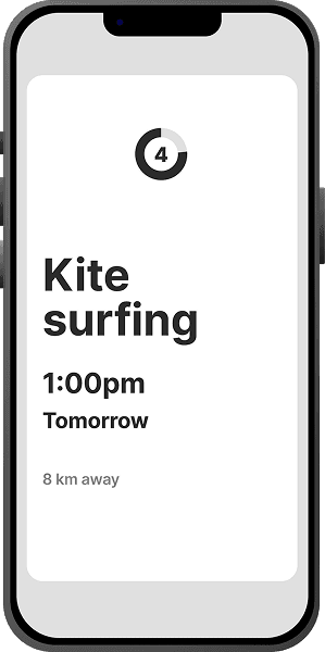
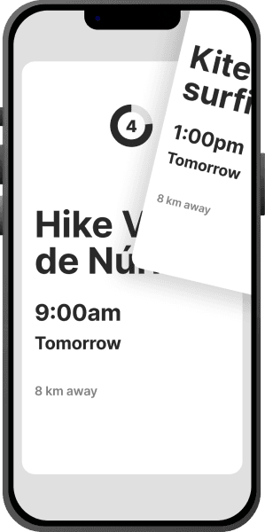
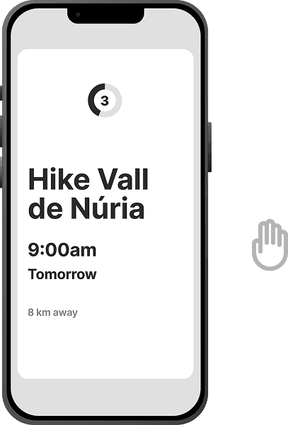
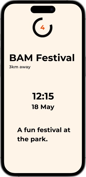
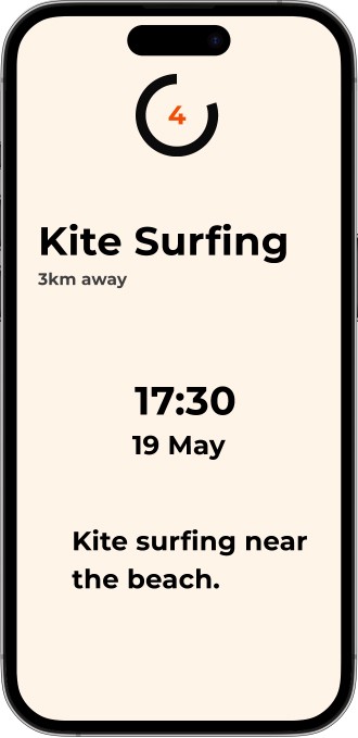
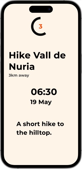
Activity Selection
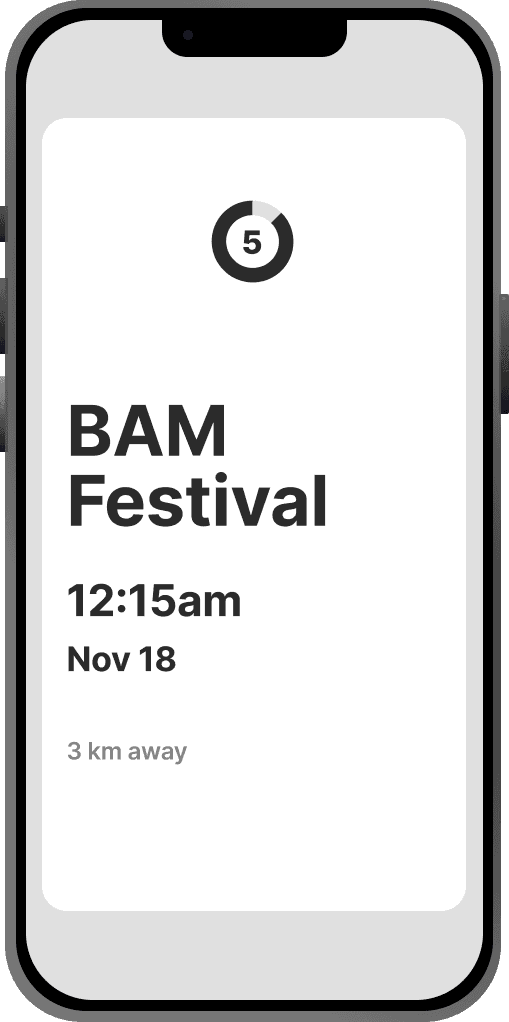
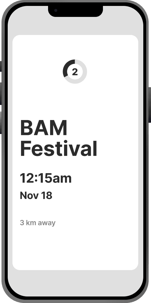
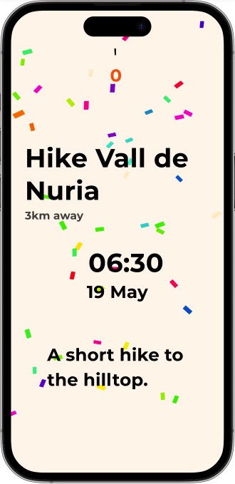
A countdown timer to choose from activities created by fellow travellers.
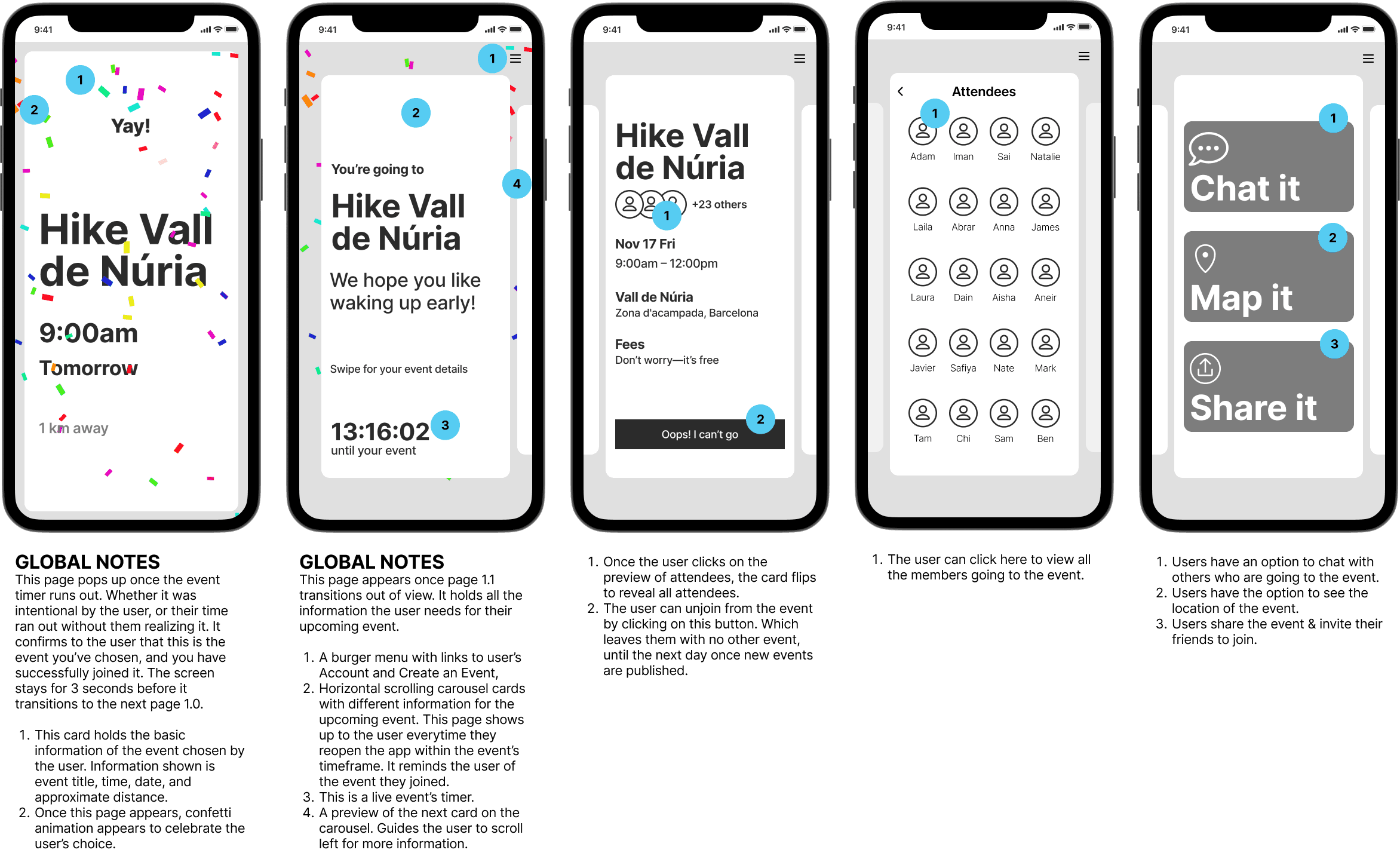
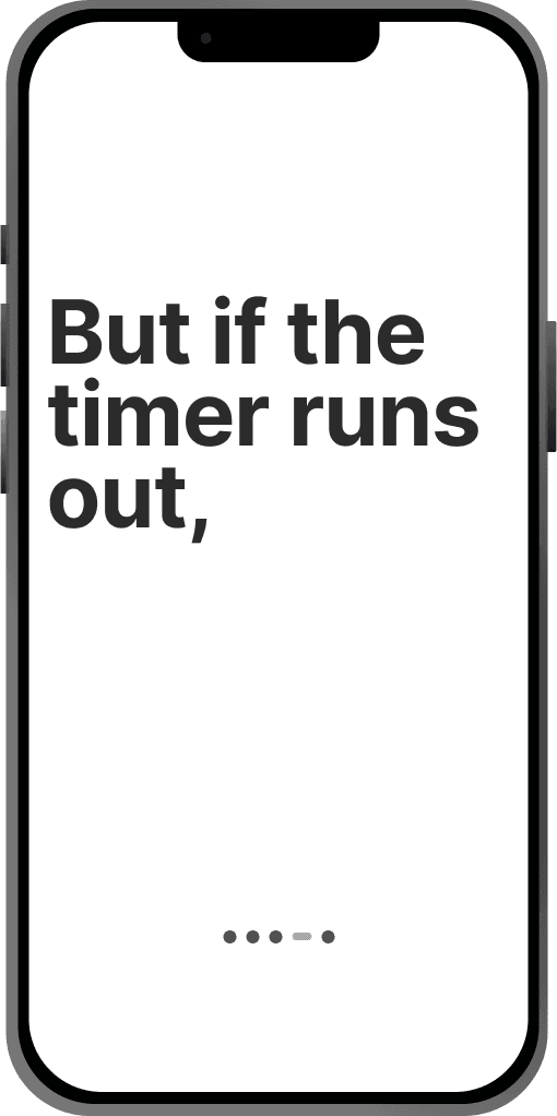
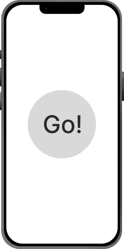
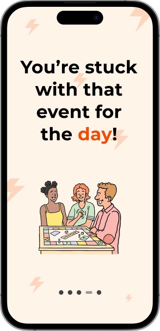
Users can swipe away unwanted events, once they let the timer run out, the selected event freezes.
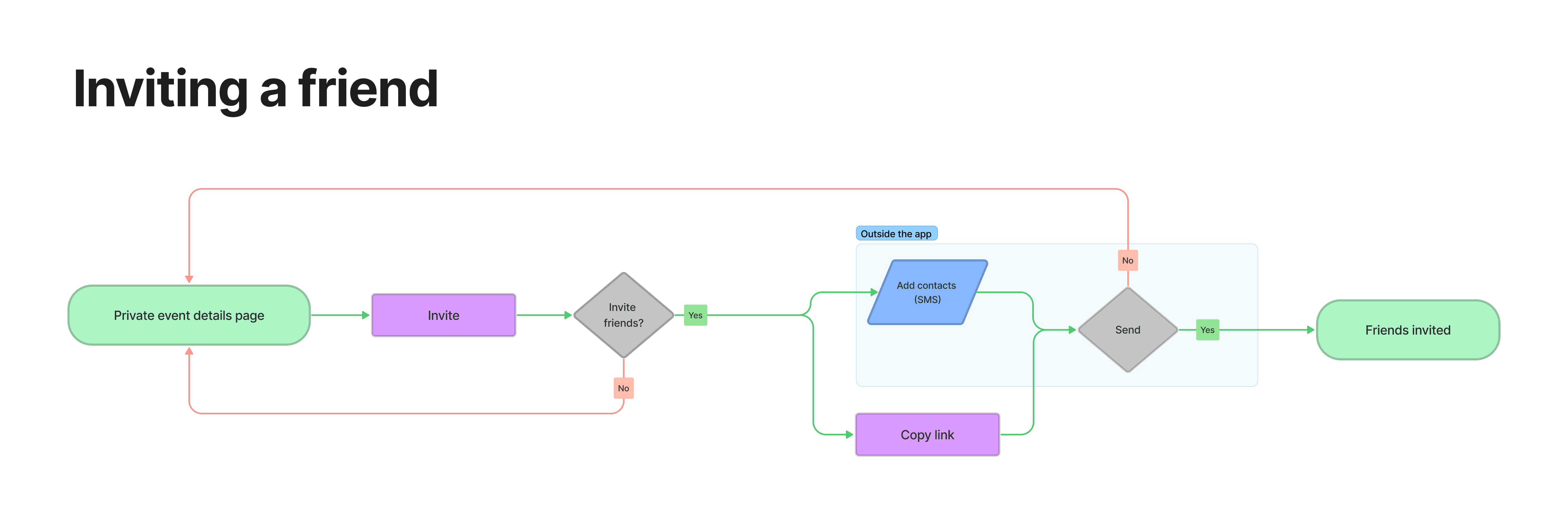
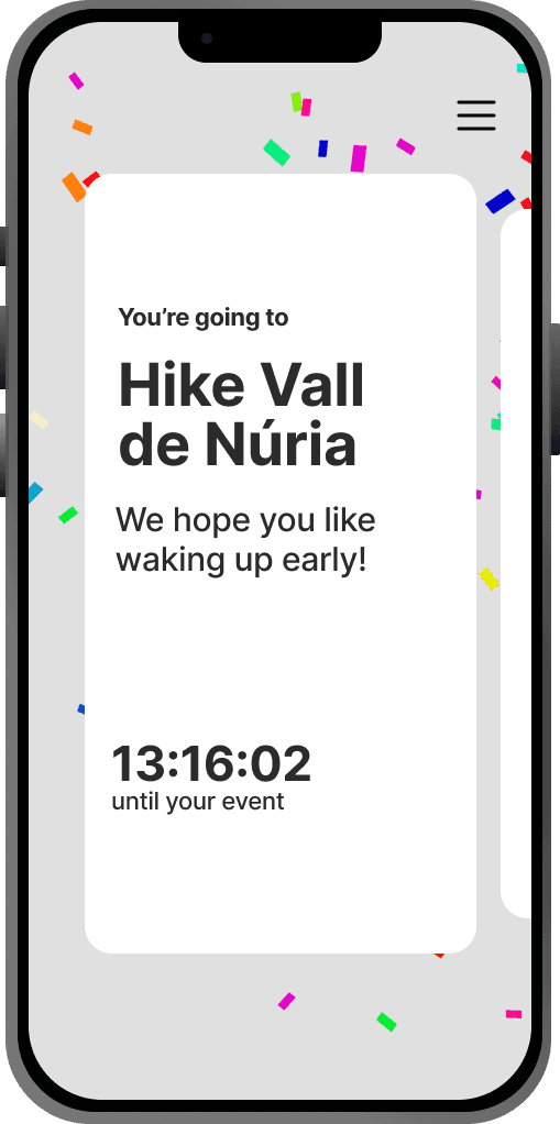
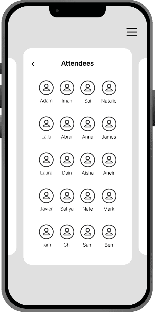
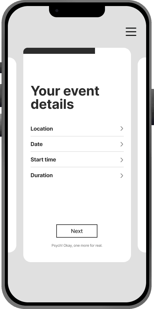
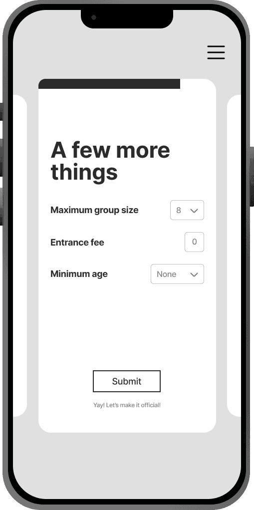
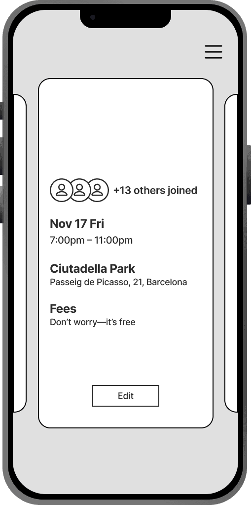
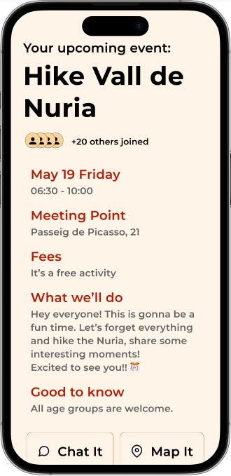
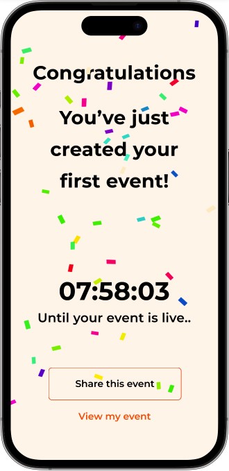
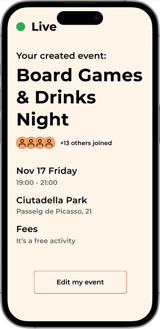
After selecting an event, users gain access to event details, including time, place, entry fee, and chat options. They can also invite friends.
A Report feature is in place for misuse or fraudulent activity.

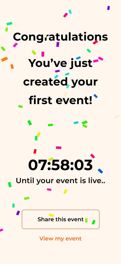
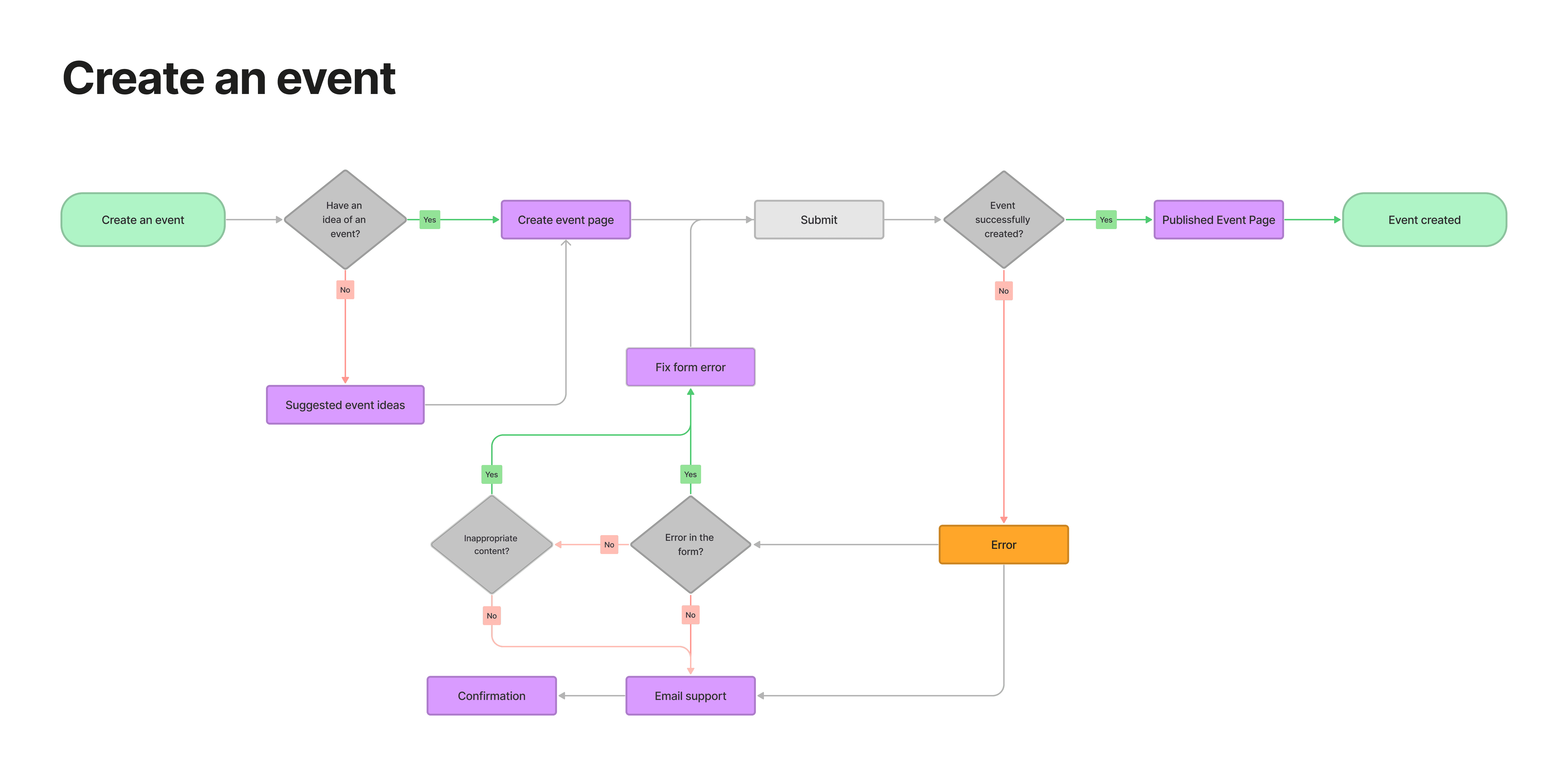
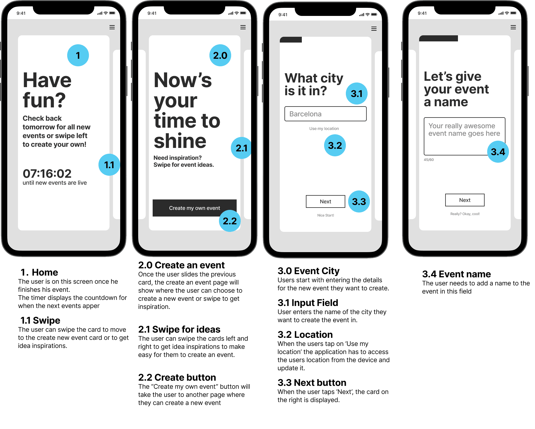
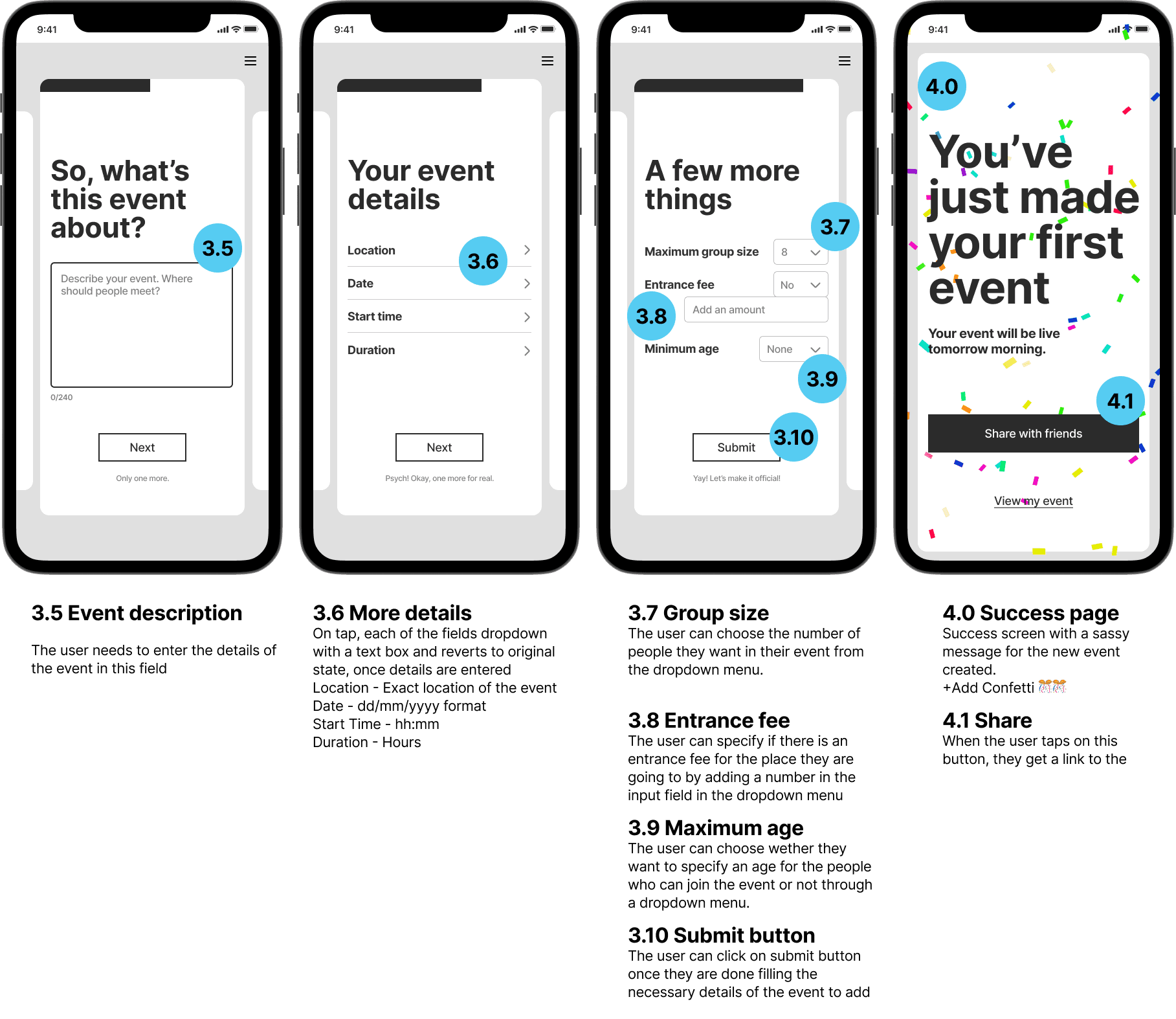
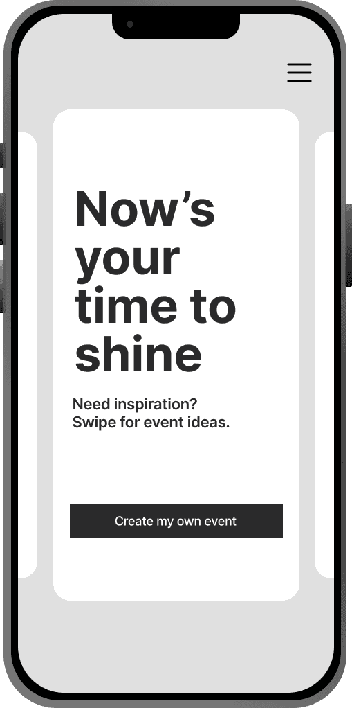
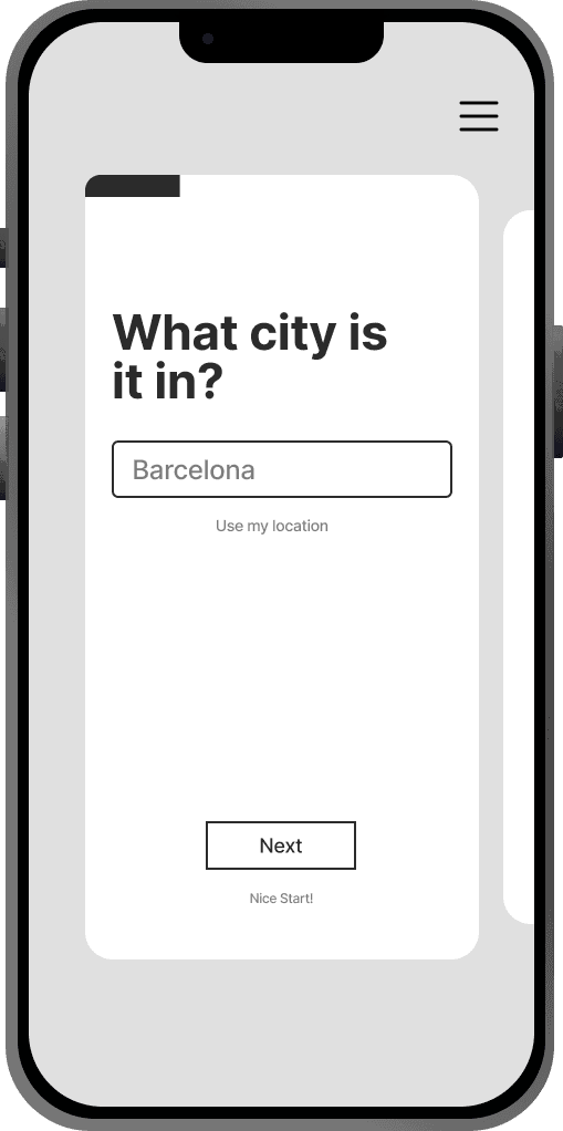
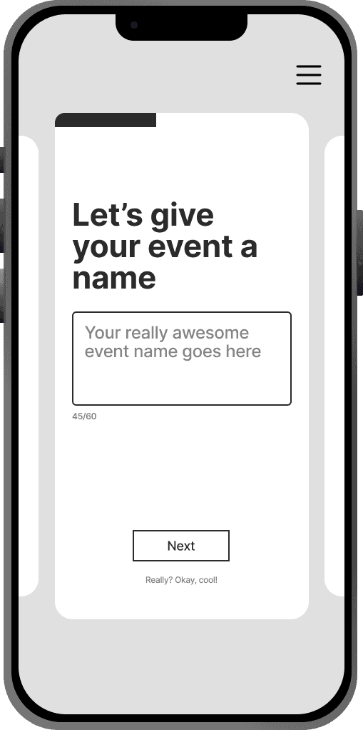
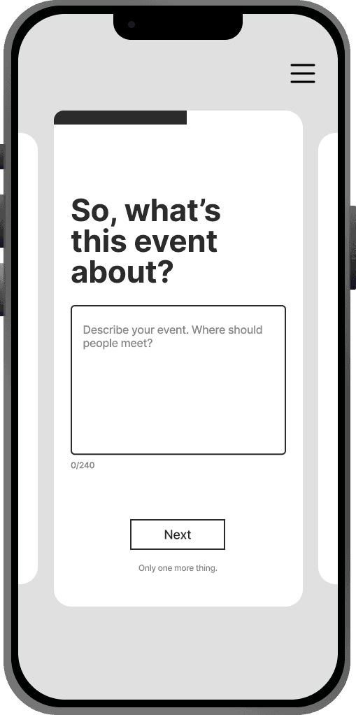
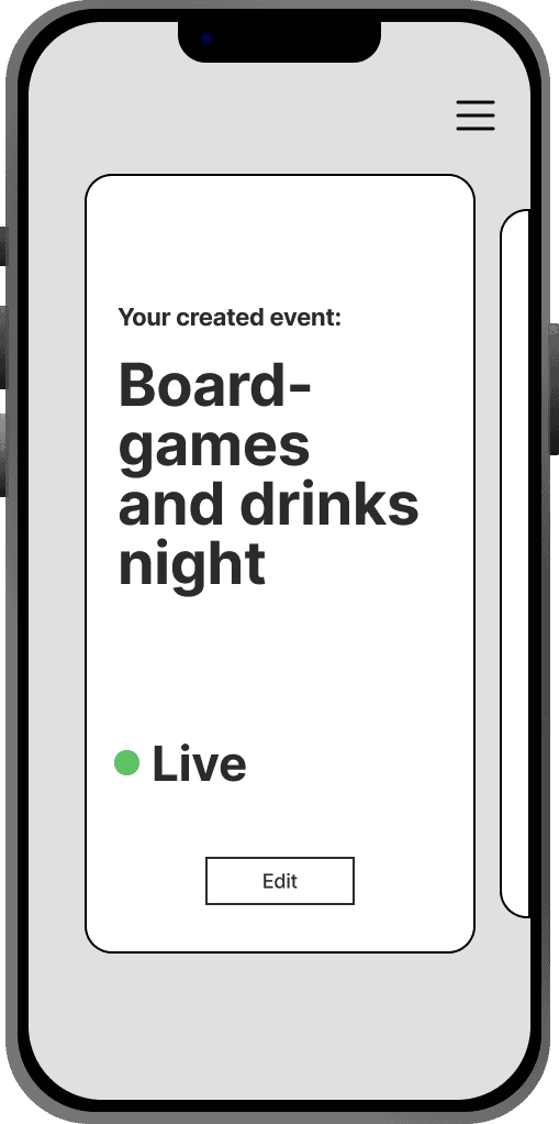
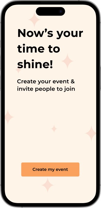
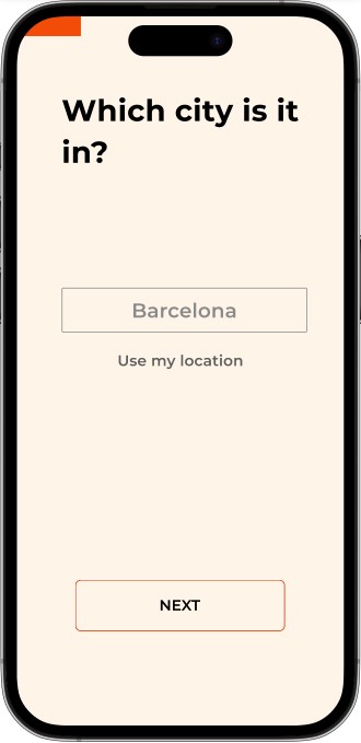
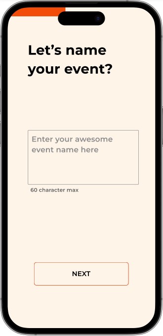
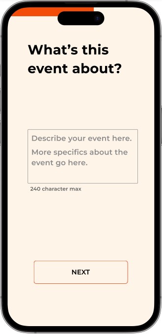
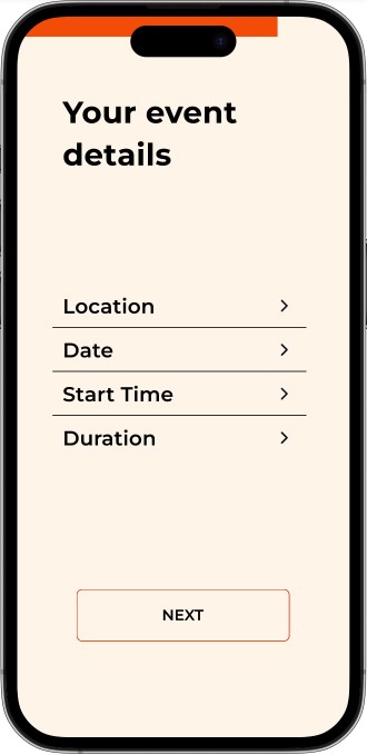
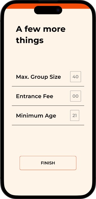
Create Event
Users can create their own activities and invite friends to join.
A form-based interface to enter activity details including name, city, category, date, time, age restrictions and entry fees.
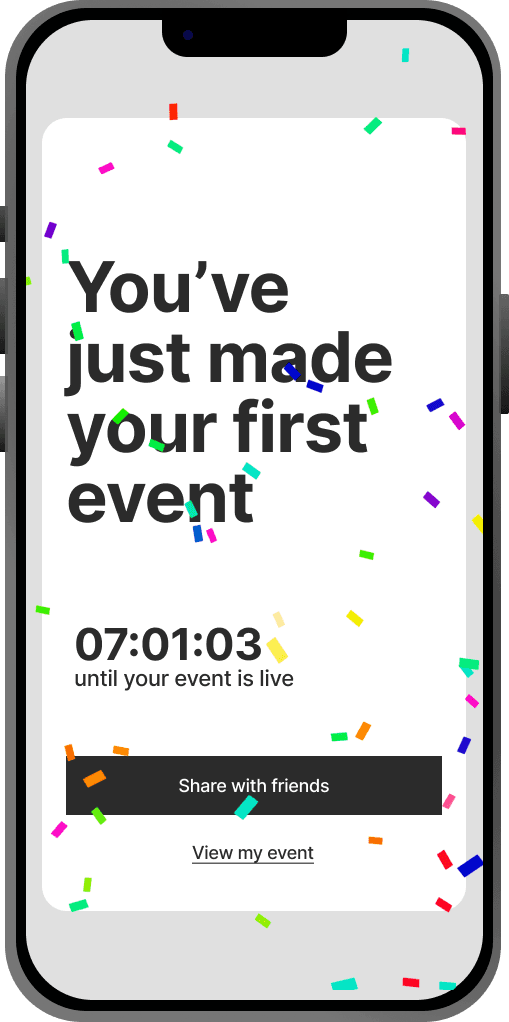
Once the details are validated, the event goes live and users can use the app's features like Chat, Map, and Share.
Bringing the Buzz to Life
After initial testing, I iterated on the design based on feedback, refining the event confirmation system and user chat functionalities. This led to an enhanced experience that was both spontaneous and user-friendly.
Lo-Fi to High-Fi Prototypes
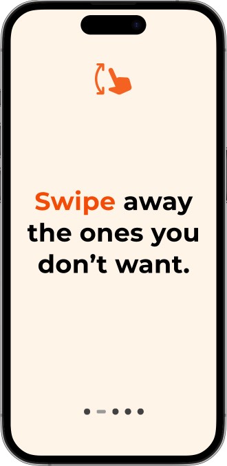
Users decide on the activity swiping away the 'uninterested' one. Let the timer run out to confirm the activity.
The activity details are presented precisely so they have everything needed hassle-free. They can chat with other participants.
Users can create new events and provide the details, once confirmed it'll be live for other users to join.
We decided to go with shades of orange as it represents joy and an outgoing feeling which resonates to the theme of this application.
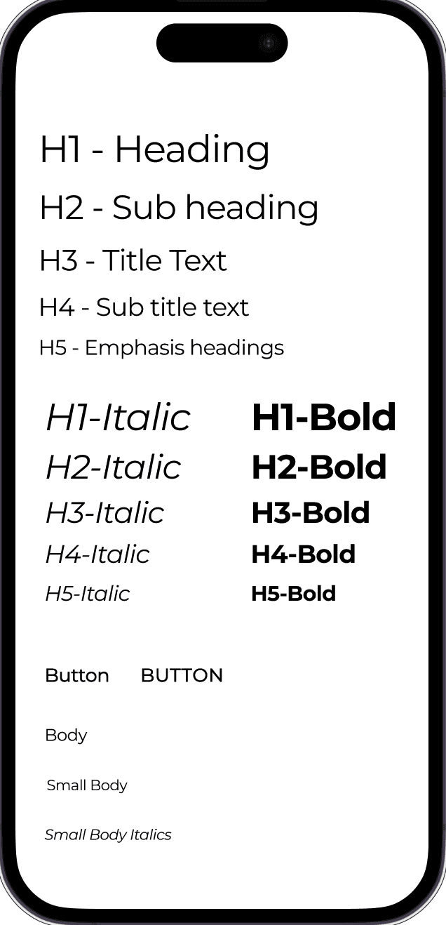
For the typography we chose a clean and bold font Montserrat.


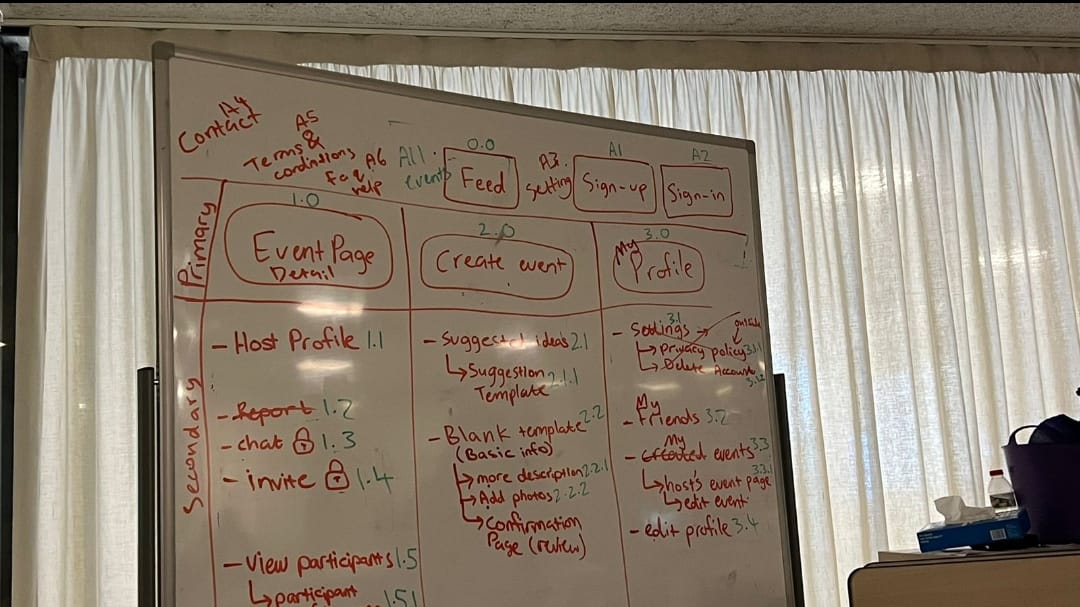
Mapping Out the Adventure
A sitemap is a visual representation, like a map, displaying the organization and interconnection of pages or screens within a website or app. It serves as a roadmap for understanding the structure and relationships between different components.
For this MVP, we designed 10 pages. Sitemap aids in clear communication among development teams, facilitating the creation of a cohesive and efficient digital solution.

Diverse User Habits
User research unveiled diverse habits, including social preferences and varying travel companions (solo or in groups), very helpful to cater features like intuitive swipe away.
Positive User Feedback
High user satisfaction ratings and positive reviews highlight the app's intuitive interface and powerful AI capabilities.
Growing User Base
The app quickly gained traction among individuals and businesses worldwide, with a steady increase in user adoption and engagement.