Navigating Barcelona's public transport system (TMB) sparked an idea for me & my team - what if buying tickets could be as simple as a tap on your phone?
The TMB Digital Ticket System transforms the outdated paper-based kiosks into a seamless, eco-friendly digital experience.
My team and I aimed to simplify the commute by creating a mobile ticketing solution that allows users to purchase, access, and manage their tickets from anywhere.
This project focuses on delivering an intuitive and efficient user interface that aligns with TMB’s brand while enhancing usability for all commuters.

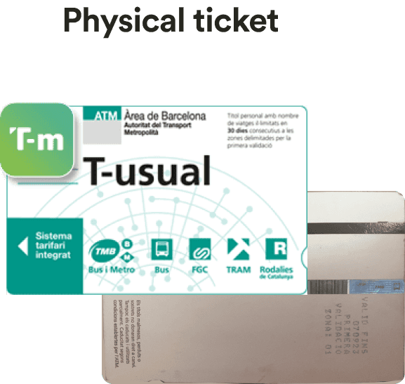
Barcelona’s public transport relies heavily on paper-based ticket kiosks, which not only create unnecessary waste but also demand time-consuming queues and complex navigation.
Newcomers and Tourists
There is no option to buy passes in the bus. Particularly challenging for newcomers and tourists.
Accessible & Eco-friendly
With a diverse commuter base, from daily locals to international visitors, there’s a need for a streamlined, accessible, and eco-friendly solution.
Tickets on the go
The current system lacks flexibility, limiting users from purchasing or accessing tickets on the go. There is no option to buy online!
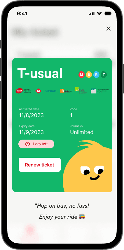
Through TMB Digital Ticket System we introduce a convenient, eco-friendly, and user-centered ticketing experience for all the commuters in Barcelona, Spain.
Ease of use & Accessibility
Designed for ease and accessibility, this digital platform enables users to buy, store and access tickets directly from their mobile devices - eliminating the need for physical kiosks and paper tickets.
Clear & Sustainable
By integrating user-friendly design elements, clear navigation, and responsive layouts, this system simplifies travel for both locals and tourists, aligning with TMB’s sustainability goals and enhancing the commuter experience across diverse user groups.
Scalable Solution
A digital-first ticketing experience that fits right in your pocket. Simple, scalable, and built for locals and tourists alike - goodbye, paper chaos.

This section details the step-by-step approach taken during the project, including research, planning, design, development, testing, and optimization phases.
Blending creative exploration with user insights to design something that actually works in the real world.
We conducted a research on the current design system and the practises of TMB.
Here's a comparison of how we sought inspiration from the current paper/kiosk based tickets to digital tickets.

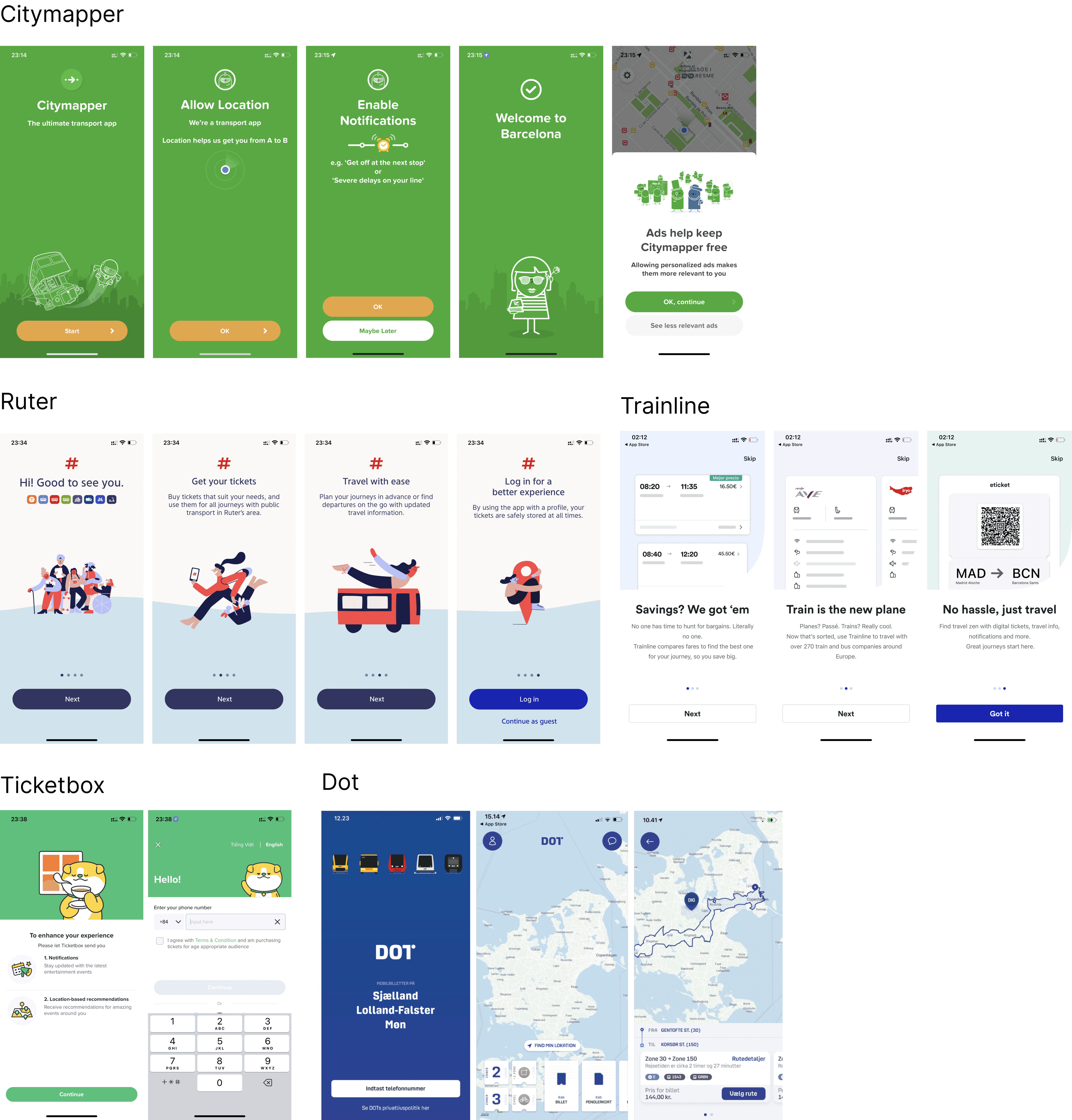
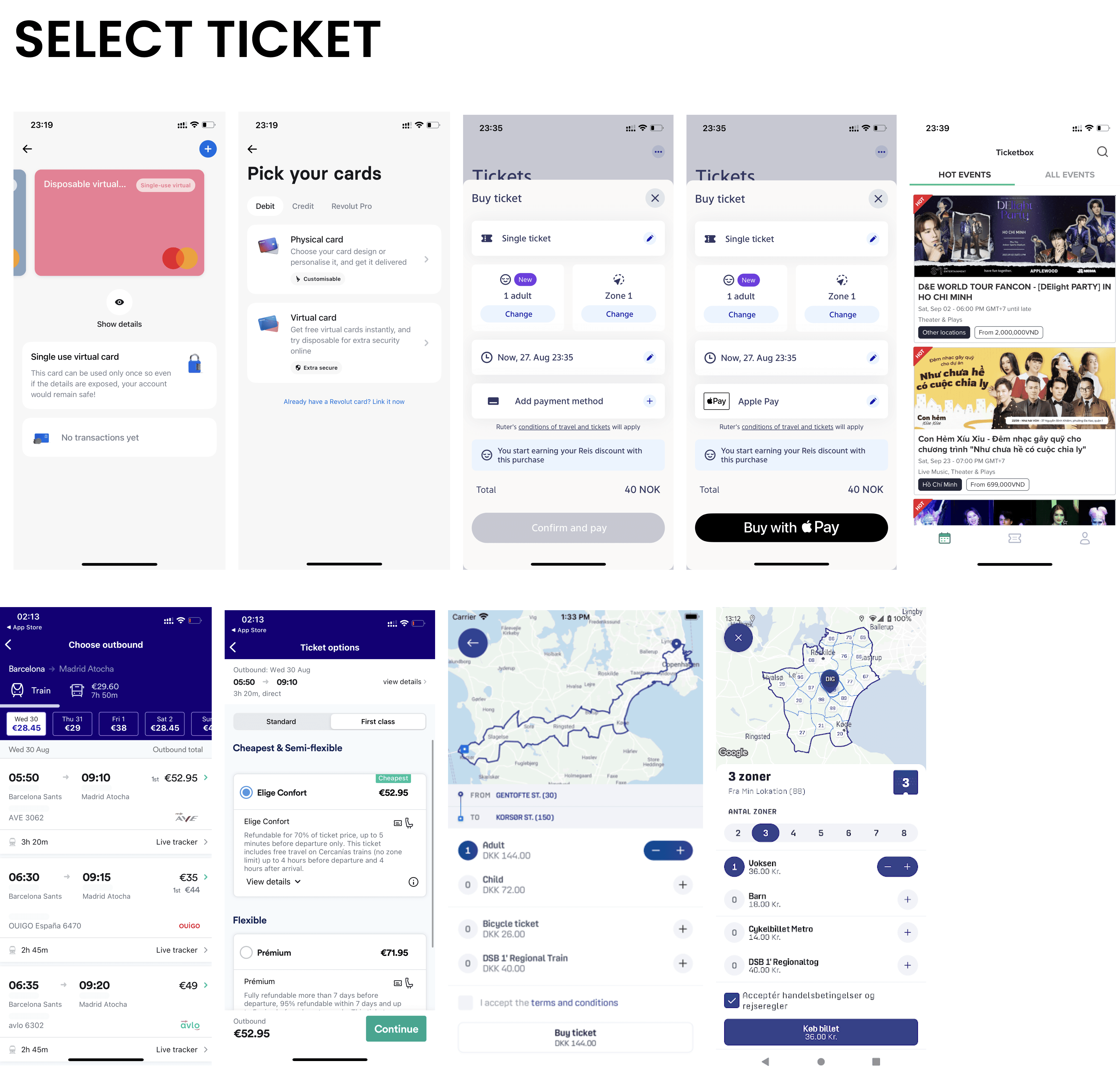
For inspiration, ideas & standard practises, my team & I looked at various other apps in this space like Trainline, Dot, Citymappr, Ruter, Revolut and few others.
Looking at these design decisions helped us pave a path for our designs with major features like select, view & save ticket.

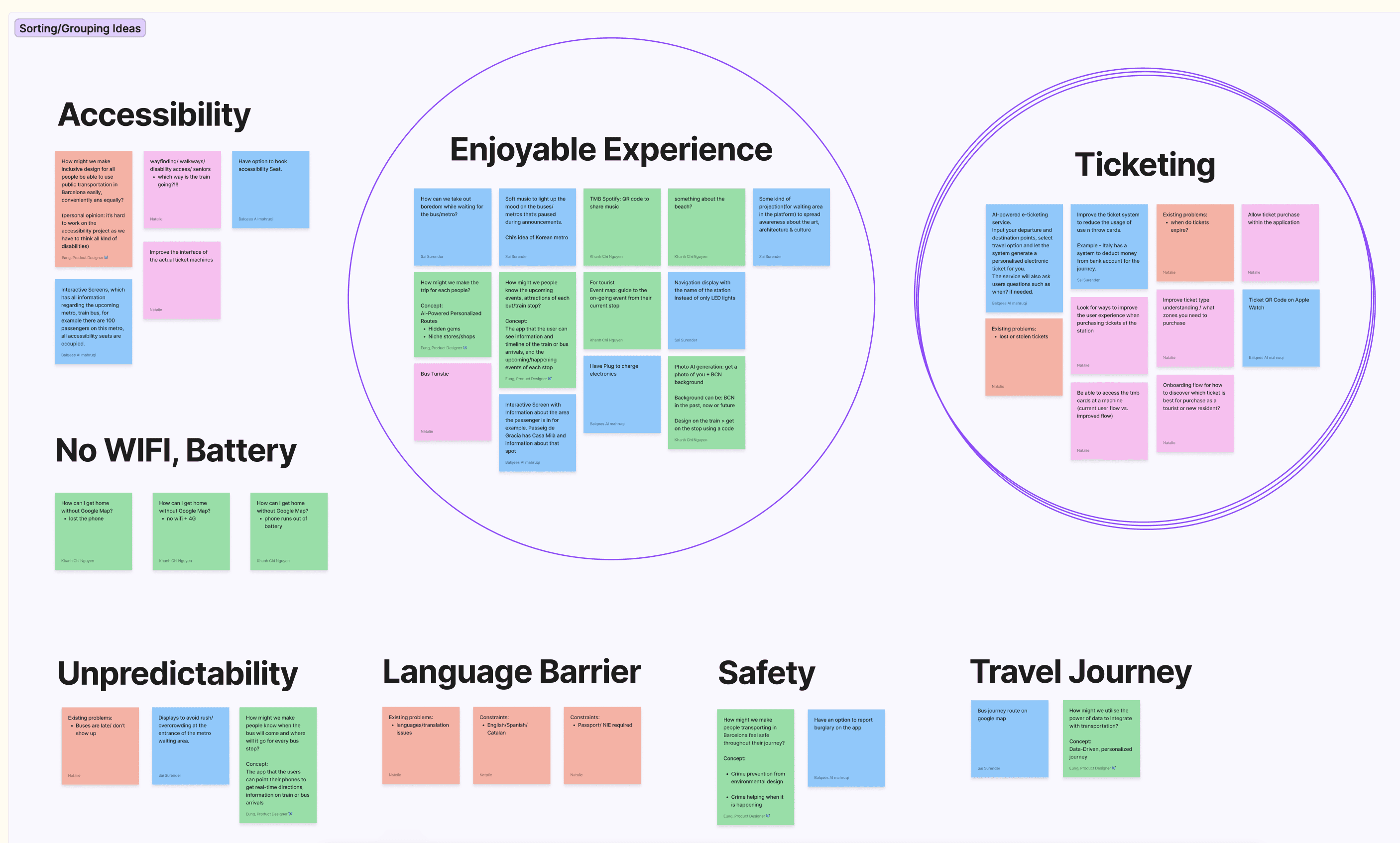
UX research played a vital role in understanding user needs, behaviours and expectations, leading to informed design decisions.
Through Research methods like feature list, card sorting, user interviews we were able to narrow down to designing best experience and an improved digital ticketing experience.
The digitization of the TMB ticket system was not just about aesthetics and technology - it was about the users.
No more queues at kiosks. No more paper trails.
Our vision?
A digital ticket, eco-friendly and available at the fingertips of every commuter.


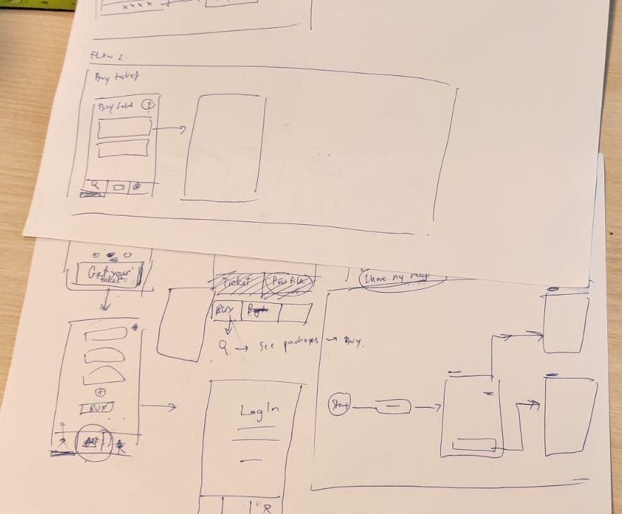

We started by designing & analysing the user flow, understanding how users will interact with the ticketing system to identify key actions like selecting ticket types, payment, and ticket retrieval.


I created low-fidelity wireframes to visualize the core flows of the app, such as onboarding, ticket selection, and ticket recommendation.
Collaborated with my team on Whimsical for this.
These Annotated Wireframes guided discussions with developers and ensured alignment across the team.
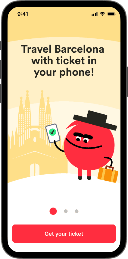
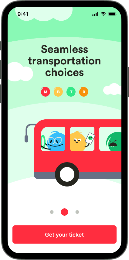
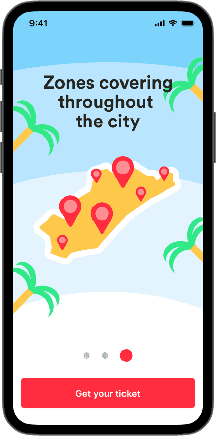
Onboarding
New users are introduced to the app, its rules, and the concept of purchasing tickets.
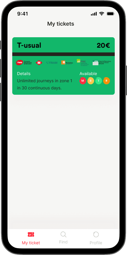
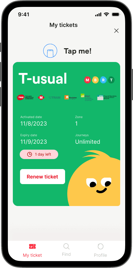
Selecting a suitable ticket
Users are presented with a list of all the tickets categorized based on the usage.
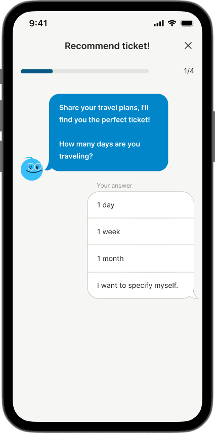
They can select a ticket based on their need. If they are confused, they can get recommendations by answering few questions.
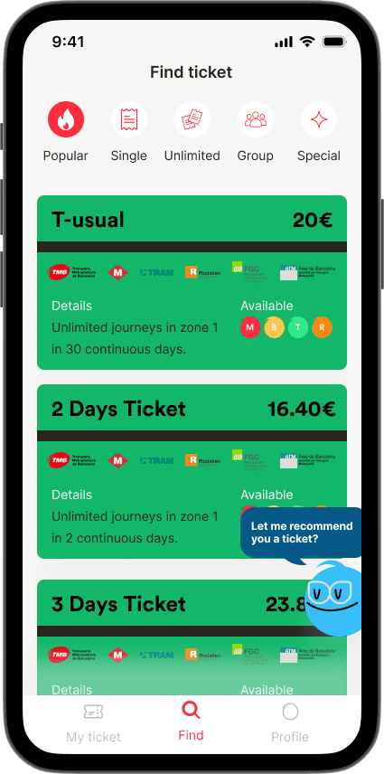


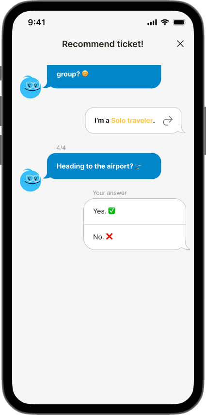
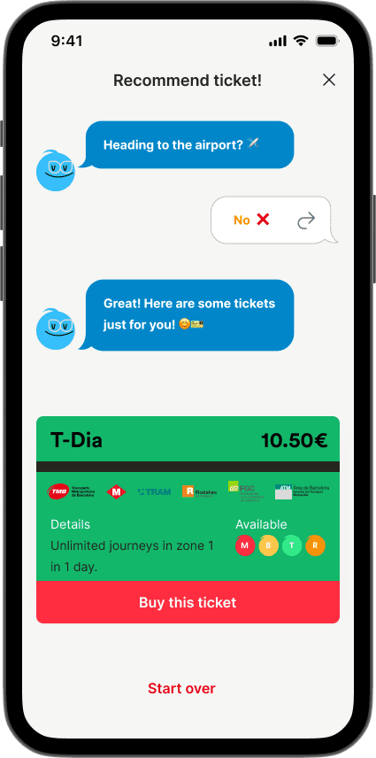
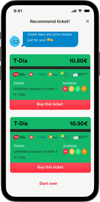
Ticket Recommendation
Users can answer few questions and we will recommend the best tickets based on their needs.


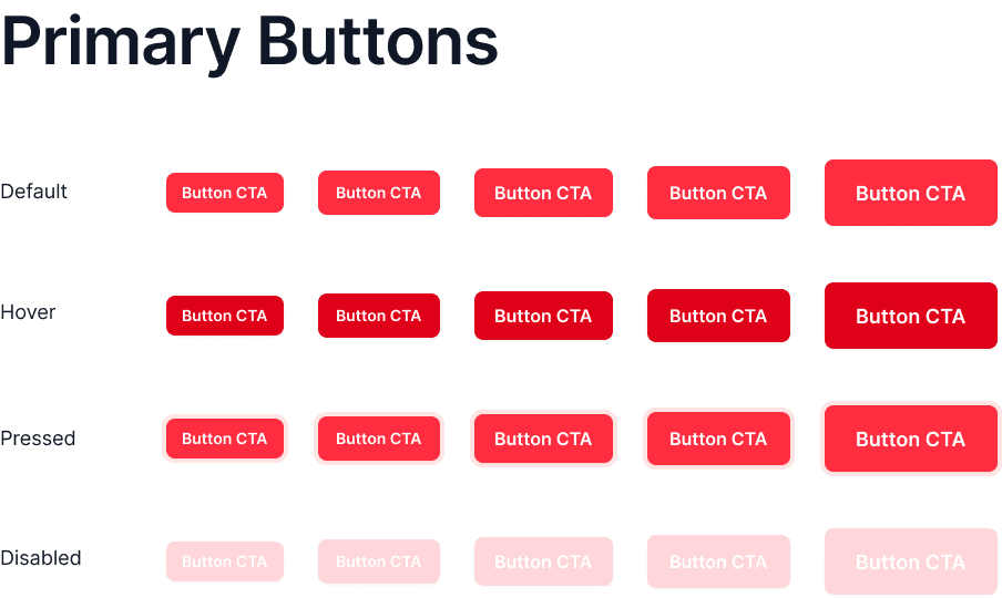
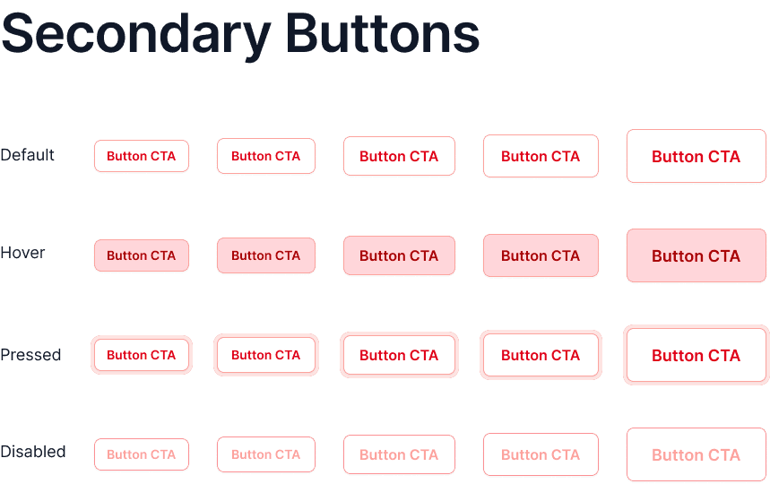
Colour
We decided to go with shades of red as it represents TMB's current branding resonates to the theme of this application.
We chose to have secondary colors as it gives good look & feel for different aspects & design elements.


For the typography we chose a clean and bold font Montserrat.


User-Centric Design is Paramount
Prioritizing the needs and expectations of a diverse user base, whether commuters or tourists, is the cornerstone of a successful public transportation digitization project.
Accessible Design Matters
The digitization journey demonstrates the importance of making public transportation accessible to everyone, fostering a more equitable and user-friendly urban environment.
Simplicity Enhances Usability
Simplicity in design, including intuitive navigation, color choices, and typography, significantly enhances the usability and user satisfaction of digital interfaces.